Refresh by Kensai
Forum rules
Topics in this forum are automatically closed 6 months after creation.
Topics in this forum are automatically closed 6 months after creation.
-
Jernau
Re: Refresh by Kensai
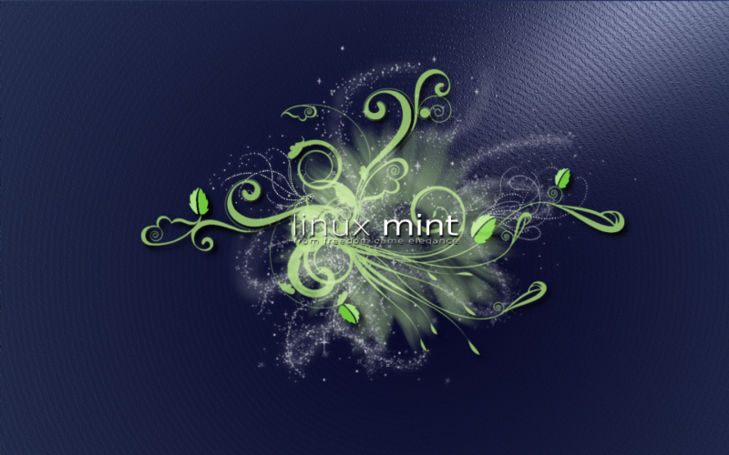
Beautiful work Kensai. 
Last edited by LockBot on Wed Dec 28, 2022 7:16 am, edited 1 time in total.
Reason: Topic automatically closed 6 months after creation. New replies are no longer allowed.
Reason: Topic automatically closed 6 months after creation. New replies are no longer allowed.
-
proxima_centauri
Re: Refresh by Kensai
ohhhh very pretty 
another version might look good if you could use the same concept but applied a dark theme to it..somehow haha
great work Kensai.
another version might look good if you could use the same concept but applied a dark theme to it..somehow haha
great work Kensai.
-
rhvkl
Re: Refresh by Kensai
wow this pretty cool ... thank you. (do you have plans for a 1280x1024 / 1.25:1 release)
/edit: zoomed view looks good for me, so there is no need for my demanded version ... but the image has a "hosted by ..." branding in the right corner :-(
/edit: zoomed view looks good for me, so there is no need for my demanded version ... but the image has a "hosted by ..." branding in the right corner :-(
-
Zwopper

- Level 10

- Posts: 3054
- Joined: Fri Nov 30, 2007 12:20 pm
- Location: Deep in the Swedish woods
- Contact:
Re: Refresh by Kensai
Nice composition!
A little too bright for me though.
Create an account at deviantArt - it's free and no fuss!
...or if you prefer imgx
A little too bright for me though.
Create an account at deviantArt - it's free and no fuss!
...or if you prefer imgx

My artwork at deviantART | My Band - Electric Alchemea
CREA DIEM!
Lenovo U330P | i5 | 16GB | 128GB - SSD | Elemantary OS 0.4

Re: Refresh by Kensai
kensai111, that is a very attractive wallpaper!
-
proxima_centauri
Re: Refresh by Kensai
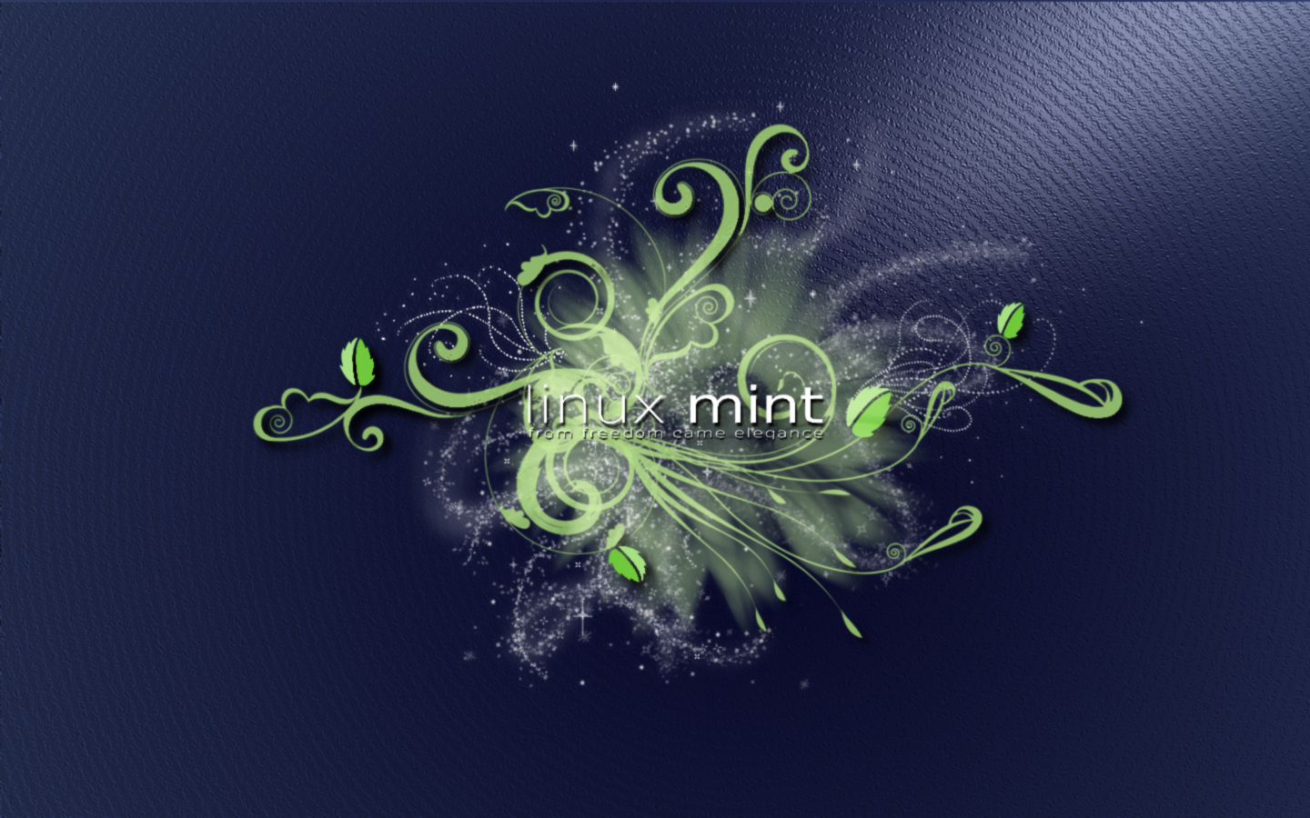
new dark wallpaper = GORGEOUS
It really accentuates the effect (to me it looks like a really neat pollen flower effect)
Beautiful.
It really accentuates the effect (to me it looks like a really neat pollen flower effect)
Beautiful.
Re: Refresh by Kensai
The dark version does look cool!


Re: Refresh by Kensai
Very, very nice! I'm going to try all of them
-
Jernau
Re: Refresh by Kensai
The dark version looks fantastic too - nice work! 
A couple of suggestions for potential improvements:
A couple of suggestions for potential improvements:
- The motif appears to be shifted to the right of centre (i.e. there is more space from the left edge of the image to the left side of the motif, than from the right edge of the image to the right side of the motif). I think it might help the composition and balance of the image if you move the motif and logo left (so they are dead centre).
- The bottom of the 'g' in 'elegance' looks like it has been chopped off.
- In my opinion, the light motif means that the logo blends in to the background a little too much (the tag line is particularly hard to read), have you tried a very subtle shadow effect (or some other technique) on the logo in an attempt to help it stand out from the background just a touch more?
-
Philip-III
Re: Refresh by Kensai
Very nice work indeed! Catches the attention immediately! A bit of an urban / house / groove flavor to it..
I agree with Jernau that the 'g' in ele'g'ance looks a bit ..like 'q', not sure where the curve disappeared, but I'm guessing it should be easy to fix. I'll have to disagree about the positioning / centering. It's just my opinion, but I think it looks better a little ..'off-beat', it adds up to the groovy feel of it, especially in the bright version - neither the motif is symmetric, nor is the background ..lighting(?!). I would probably go even further with dispositioning the whole thing - a little lower / higher to the right or left, as an alternative vision. Of course dead-centered version will be fine as well as an alternative..
About the tagline - it blends pretty well, not sure if it'd be better standing out more
But enough of me commenting on other people's comments

What I actually wanted to comment on were the multiple 'mint-leaves' .. Nice placement, I must admit, however they seem to stand out a little too much. Removing them completely probably won't do much justice, but perhaps making them a little more subtle so they can blend in better with the motif would add some more 'class' to it. Maybe making the colors on the mint-leaves a little closer to the rest of the motif will add the subtlety to make it perfect!
Keep up the good work!
I agree with Jernau that the 'g' in ele'g'ance looks a bit ..like 'q', not sure where the curve disappeared, but I'm guessing it should be easy to fix. I'll have to disagree about the positioning / centering. It's just my opinion, but I think it looks better a little ..'off-beat', it adds up to the groovy feel of it, especially in the bright version - neither the motif is symmetric, nor is the background ..lighting(?!). I would probably go even further with dispositioning the whole thing - a little lower / higher to the right or left, as an alternative vision. Of course dead-centered version will be fine as well as an alternative..
About the tagline - it blends pretty well, not sure if it'd be better standing out more
But enough of me commenting on other people's comments
What I actually wanted to comment on were the multiple 'mint-leaves' .. Nice placement, I must admit, however they seem to stand out a little too much. Removing them completely probably won't do much justice, but perhaps making them a little more subtle so they can blend in better with the motif would add some more 'class' to it. Maybe making the colors on the mint-leaves a little closer to the rest of the motif will add the subtlety to make it perfect!
Keep up the good work!
-
rhvkl
Re: Refresh by Kensai
LinuxMint Goes Transparent ... yes it does :) ... *background changed* <-- thanks!
-
Harrs
Re: Refresh by Kensai
Great Work i did a small modification
http://fc18.deviantart.com/fs40/f/2009/ ... ghtypi.png <--Big Image URL 1440 x900
Shadow arround the letters for better readability and i did a new Background
maybe you could vary the background arround the "linux" letters and make them a little darker then it would be perfect
http://fc18.deviantart.com/fs40/f/2009/ ... ghtypi.png <--Big Image URL 1440 x900
Shadow arround the letters for better readability and i did a new Background
maybe you could vary the background arround the "linux" letters and make them a little darker then it would be perfect
Re: Refresh by Kensai
There is a post somewhere in the artwork section of the forum that answers that question. I saw the post yesterday but I can't find it now... I remember that is has to be complete, usplash, wallpaper (wide screen and normal), gdm theme (wide screen and normal) and use the official logo. I did see in the Mint 7 road map that Clem is interested in using new artwork. Sorry I could not find the post regarding this and maybe someone can point you to it.Just a quick question while on the subject... how does one go about getting selected or nominated if you will to make it into the official release of Linux Mint artwork-wise?
-
DaddyFoxDerek
Re: Refresh by Kensai
This wallpaper is very nice. Using it now. Thanks for posting it.