That is handy. ThanksJosephM wrote:I just created a simple applet to make working on Cinnamon themes a bit easier. It adds a button to the panel to refresh the current Cinnamon theme so that you don't have to keep restarting Cinnamon after every change. [/url]
How To Theme The Cinnamon Taskbar Panel and Window List Tabs
Forum rules
Before you post read how to get help. Topics in this forum are automatically closed 6 months after creation.
Before you post read how to get help. Topics in this forum are automatically closed 6 months after creation.
-
austin.texas

- Level 20

- Posts: 12003
- Joined: Tue Nov 17, 2009 3:57 pm
- Location: at /home
Re: How To Theme The Cinnamon Taskbar Panel and Window List
Mint 18.2 Cinnamon, Quad core AMD A8-3870 with Radeon HD Graphics 6550D, 8GB DDR3, Ralink RT2561/RT61 802.11g PCI
Linux Linx 2018
Linux Linx 2018
-
Brahim Salem
Re: How To Theme The Cinnamon Taskbar Panel and Window List
great applet josephM many thanks 
-
Brahim Salem
Re: How To Theme The Cinnamon Taskbar Panel and Window List
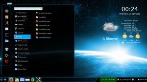
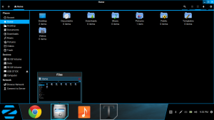
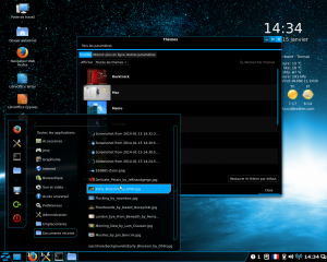
Zorin OS 8 looks like this now:
-
Brahim Salem
Re: How To Theme The Cinnamon Taskbar Panel and Window List
I have attached the default panel launcher and window list hover PNGs of Zorin 8
Note:
1- when you move the cursor over the launcher you get a blue glow colour (included in the attached file)
2- when you lauch an application from launcher the sqaure become blue
3- when you move the cursor over an active tab you get a blue glow (the sqaure already blue)

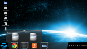
Please not also that the menu is cut from the right bottom corner:
Note:
1- when you move the cursor over the launcher you get a blue glow colour (included in the attached file)
2- when you lauch an application from launcher the sqaure become blue
3- when you move the cursor over an active tab you get a blue glow (the sqaure already blue)
Please not also that the menu is cut from the right bottom corner:
-
austin.texas
- Level 20
- Posts: 12003
- Joined: Tue Nov 17, 2009 3:57 pm
- Location: at /home
Re: How To Theme The Cinnamon Taskbar Panel and Window List
Please include the code so that we can see how that is done.
Mint 18.2 Cinnamon, Quad core AMD A8-3870 with Radeon HD Graphics 6550D, 8GB DDR3, Ralink RT2561/RT61 802.11g PCI
Linux Linx 2018
Linux Linx 2018


Re: How To Theme The Cinnamon Taskbar Panel and Window List
too bad cinnamon doesn't support chamfer (chamfer= cut away corner )
edit: just realized what the number after url in border-image means. there is no limit now
edit: just realized what the number after url in border-image means. there is no limit now

deviantArt http://fmcgorenc.deviantart.com/
gnome-look http://gnome-look.org/usermanager/searc ... name=gmc85
-
austin.texas
- Level 20
- Posts: 12003
- Joined: Tue Nov 17, 2009 3:57 pm
- Location: at /home
Re: How To Theme The Cinnamon Taskbar Panel and Window List
border-image: url("hover-1.png") 6; is the same as border-image: url("hover-1.png") 6 6;
Right?
Right?
Mint 18.2 Cinnamon, Quad core AMD A8-3870 with Radeon HD Graphics 6550D, 8GB DDR3, Ralink RT2561/RT61 802.11g PCI
Linux Linx 2018
Linux Linx 2018
Re: How To Theme The Cinnamon Taskbar Panel and Window List
not sure I just experiment (trial&error). there can be 4 numbers. i guess for 4 sides ( http://border-image.com/ is helpfull).austin.texas wrote:border-image: url("hover-1.png") 6; is the same as border-image: url("hover-1.png") 6 6;
Right?
deviantArt http://fmcgorenc.deviantart.com/
gnome-look http://gnome-look.org/usermanager/searc ... name=gmc85
-
Brahim Salem
Re: How To Theme The Cinnamon Taskbar Panel and Window List
Great I check the progress you made on the zorin theme gm85 few things still need a fix:
1- the blue hover on the right panel
2- the borders of the menu serach box
3- the corner-ripple
I know it is a WIP but just reminding you!
The window list hover is just awesome. It looks exactly like zorin's
few things still need a fix:1- the blue hover on the right panel
2- the borders of the menu serach box
3- the corner-ripple
I know it is a WIP but just reminding you!
The window list hover is just awesome. It looks exactly like zorin's
-
Brahim Salem
Re: How To Theme The Cinnamon Taskbar Panel and Window List
One more thing:
1- I tried the hover effect with "window list with applications grouping" and the blue hover works only on active apps!! On zorin you get the same blue glow hover on both
2- modal dialogues not fixed yet
1- I tried the hover effect with "window list with applications grouping" and the blue hover works only on active apps!! On zorin you get the same blue glow hover on both
2- modal dialogues not fixed yet
Re: How To Theme The Cinnamon Taskbar Panel and Window List
"window list with applications grouping" behaves somewhat differently than regular "window list" applet. I can't do anything about it.Brahim wrote:One more thing:
1- I tried the hover effect with "window list with applications grouping" and the blue hover works only on active apps!! On zorin you get the same blue glow hover on both
should i make the menu favorites and application button have the chamfered corner too ?
deviantArt http://fmcgorenc.deviantart.com/
gnome-look http://gnome-look.org/usermanager/searc ... name=gmc85
-
Brahim Salem
Re: How To Theme The Cinnamon Taskbar Panel and Window List
The chanfer is on the menu only but not on the popup There two themes I know of that made the me,nu different from the popup: 1- Metro ; [url] http://cinnamon-
spices.linuxmint.com/themes/view/188[/url]
2-
Windows 7 Basic light: http://cinnamon-spices.linuxmint.com/themes/view/108
you still neecd to fix the modal dialogues. Use Mint-X theme it will allow you to fix the hover with the window list with apps grouping and the modal dialogues easily Plus it supports cinnamon 2.0 better than this theme
There two themes I know of that made the me,nu different from the popup: 1- Metro ; [url] http://cinnamon-spices.linuxmint.com/themes/view/188[/url]
2-
Windows 7 Basic light: http://cinnamon-spices.linuxmint.com/themes/view/108
you still neecd to fix the modal dialogues. Use Mint-X theme it will allow you to fix the hover with the window list with apps grouping and the modal dialogues easily
Plus it supports cinnamon 2.0 better than this theme Re: How To Theme The Cinnamon Taskbar Panel and Window List
i don't think soBrahim wrote:The chanfer is on the menu only but not on the popup


deviantArt http://fmcgorenc.deviantart.com/
gnome-look http://gnome-look.org/usermanager/searc ... name=gmc85
-
Brahim Salem
Re: How To Theme The Cinnamon Taskbar Panel and Window List
gmc85 wrote:i don't think soBrahim wrote:The chanfer is on the menu only but not on the popup
woooooooooooooooooooooooooww
-
Brahim Salem
Re: How To Theme The Cinnamon Taskbar Panel and Window List
Check this css gm85 just place it in zorin os 8 file and see what happens. You need to tweak few things though and add support to cinnamon 2.0:
Code: Select all
/* ###################################################################
 * Section common with Gnome Shell
 * ... contains a few cinnamon specific styles (rare occurences)
 * ###################################################################*/
stage {
    font-family: 'Droid sans', Trebuchet MS, Liberation Sans, sans, sans-serif;
	font-size: 10pt;
	color: white;
}

/* small fonts */
.run-dialog-label, .run-dialog-error-label {
    font-size: 8pt;
}
/* small 7.5 pt */
.calendar-month-label, .calendar-day-base {
    font-size: 7.5pt;
}
/* small bold fonts */
.window-caption, .switcher-list {
    font-size: 8pt;
    font-weight: normal;
    color: #303030;
}
.cinnamon-link {
    color: #0000ff;
    text-decoration: underline;
}
.cinnamon-link:hover {
    color: #0000e0;
}

.label-shadow {
    color: rgba(0,0,0,0.5);
}

StScrollBar
{
  padding: 0px;
}

StScrollView.vfade
{
  -st-vfade-offset: 68px;
}

StScrollView StScrollBar
{
  min-width: 17px;
  min-height: 16px;
}


StScrollBar StBin#trough {
    background-color: rgba(233,233,233,0.4);
    border: none;
}

StScrollBar StButton#vhandle
{
    background-color: #CDCDCD;
    border: 1px rgba(0,0,0,0.4);
}

StScrollBar StButton#hhandle
{
    background-color: #CDCDCD;
    border: 2px rgba(114,159,207,0.5);
}

StScrollBar StButton#hhandle:hover,
StScrollBar StButton#vhandle:hover
{
    background-color: #A6A6A6;
}

#Tooltip {
    border: 1px solid #767676;
    padding: 2px 8px;
    background-color: #fff;
    color: #575757;
    font-size: 10pt;
    text-align: center;
    box-shadow: 2px 2px 4px #000;
}

/* ===================================================================
 * Shared button properties
 * ===================================================================*/

.notification-button, .notification-icon-button,
.hotplug-notification-item, .hotplug-resident-eject-button,
.modal-dialog-button {
    color: #303030;
	border: 1px solid rgba(245,245,245,0.2);
}

.notification-button:hover,
.notification-icon-button:hover, .hotplug-notification-item:hover,
.hotplug-resident-eject-button:hover, .modal-dialog-button:hover {
    background-color: rgba(52,101,164,1);
    border: 1px rgba(32,74,135,0.8);
	box-shadow: inset 0px 0px 2px 1px rgba(114,159,207,1);
}

.notification-button:focus,
.notification-icon-button:focus, .hotplug-notification-item:focus,
.modal-dialog-button:focus {
    border: 0px solid #8b8b8b;
}

.notification-button:active, .notification-icon-button:active,
.hotplug-notification-item:active, .hotplug-resident-eject-button:active,
.modal-dialog-button:active, .modal-dialog-button:pressed {
    background-color: rgba(114,159,207,1);
    border: 1px rgba(32,74,135,0.8);
	box-shadow: inset 0px 0px 2px 1px rgba(114,159,207,1);
}

/* ===================================================================
 * PopupMenu (popupMenu.js)
 * ===================================================================*/

.popup-menu-boxpointer {
	-arrow-border-radius: 0px 0px 8px 0px;
	-arrow-background-color: rgba(0,0,0,0.9);
	-arrow-border-width: 1px;
	-arrow-border-color: #00A7FB;
	-arrow-base: 0px;
	-arrow-rise: 1px;
}
.popup-menu {
	color: #ffffff;
	font-size: 9.5pt;
	min-width: 100px;
}
.popup-submenu-menu-item:open {
	background-color: #4c4c4c;
}
.popup-sub-menu {
	background-gradient-start: rgba(80,80,80,0.3);
	background-gradient-end: rgba(80,80,80,0.7);
	background-gradient-direction: vertical;
}
.popup-sub-menu .popup-menu-item:ltr {
	padding-right: 0em;
}
.popup-sub-menu .popup-menu-item:rtl {
	padding-left: 0em;
}
.popup-sub-menu StScrollBar {
	padding: 4px;
}
.popup-sub-menu StScrollBar StBin#trough {
	border-width: 0px;
}
.popup-sub-menu StScrollBar StBin#vhandle {
	background-color: #4c4c4c;
	border-width: 0px;
}
.popup-combo-menu {
	background-color: rgba(0,0,0,0.9);
	padding: 1em 0em;
	color: #ffffff;
	font-size: 10.5pt;
	border: 1px solid #00A7FB;
	border-radius: 0px 0px 8px 0px;
}
/* The remaining popup-menu sizing is all done in ems, so that if you
 * override .popup-menu.font-size, everything else will scale with it.
 */
.popup-menu-content {
	padding: 1em 0em;
}
.popup-menu-item {
	padding: .4em 1.75em;
	spacing: 1em;
}
.popup-menu-item:active {
	background-color: #68d3ff;
}
.popup-menu-item:insensitive {
	color: #9f9f9f;
}
.popup-image-menu-item {
}
.popup-combobox-item {
	spacing: 1em;
}
.popup-separator-menu-item {
	-gradient-height: 2px;
	-gradient-start: rgba(85,85,85,1);
	-gradient-end: #555555;
	-margin-horizontal: 1.5em;
	height: 1em;
}
.popup-alternating-menu-item:alternate {
	font-weight: bold;
}
.popup-slider-menu-item {
	height: 1em;
	min-width: 15em;
	-slider-height: 0.3em;
	-slider-background-color: #666666;
	-slider-border-color: #555555;
	-slider-active-background-color: #CCCCCC;
	-slider-active-border-color: #DDDDDD;
	-slider-border-width: 1px;
	-slider-handle-radius: 0.5em;
}
.popup-device-menu-item {
	spacing: .5em;
}
.popup-inactive-menu-item {
	font-weight: normal;
	color: #999;
}
.popup-subtitle-menu-item {
	font-weight: bold;
}
.popup-menu-icon {
	icon-size: 1.14em;
}
/* Switches (to be used in menus) */
.toggle-switch {
	width: 65px;
	height: 22px;
}
.toggle-switch-us {
	background-image: url("toggle-off-us.svg");
}
.toggle-switch-us:checked {
	background-image: url("toggle-on-us.svg");
}
.toggle-switch-intl {
	background-image: url("toggle-off-intl.svg");
}
.toggle-switch-intl:checked {
	background-image: url("toggle-on-intl.svg");
}
.nm-menu-item-icons {
	spacing: .5em;
}
/* ===================================================================
 * Panel (panel.js)
 * ===================================================================*/

#panel {
	border-image: url('panel.png');
	font-size: 8.5pt;
	font-weight: normal;
	height: 40px;
}
#panelLeft {
	spacing: 4px;
}
#panelCenter {
	spacing: 4px;
}
#panelRight {
	border-image: url('panel-right.png');
}

#panelLeft:dnd {
	background-gradient-direction: vertical;
	background-gradient-start: rgba(255,0,0,0.05);
	background-gradient-end: rgba(255,0,0,0.2);
}
#panelCenter:dnd {
	background-gradient-direction: vertical;
	background-gradient-start: rgba(0,255,0,0.05);
	background-gradient-end: rgba(0,255,0,0.2);
}
#panelRight:dnd {
	background-gradient-direction: vertical;
	background-gradient-start: rgba(0,0,255,0.05);
	background-gradient-end: rgba(0,0,255,0.2);
}
#panelLeft:ltr {
	padding-right: 4px;
}
#panelLeft:rtl {
	padding-left: 4px;
}
#panelRight:ltr {
	padding-left: 20px;
	spacing: 0px;
}
#panelRight:rtl {
	padding-right: 20px;
	spacing: 0px;
}
.panel-top {
}
.panel-bottom {
}
.panel-status-button {
	border: 0px solid #8b8b8b;
	-natural-hpadding: 3px;
	-minimum-hpadding: 3px;
	font-weight: bold;
	color: #ccc;
	height: 22px;
}
.panel-status-button:hover {
	color: white;
}
.system-status-icon {
	padding-left: 0px;
	padding-right: 0px;
	spacing: 0px;
	margin: 0px;
}

.panel-corner {
	-panel-corner-radius: 0px;
	-panel-corner-background-color: black;
	-panel-corner-inner-border-width: 2px;
	-panel-corner-inner-border-color: transparent;
	-panel-corner-outer-border-width: 1px;
	-panel-corner-outer-border-color: #536272;
}
.panel-corner:active,
.panel-corner:overview,
.panel-corner:focus {
	-panel-corner-inner-border-color: rgba(255,255,255,0.8);
}
#appMenu {
	spacing: 4px;
}
.panel-button #appMenuIcon {
	app-icon-bottom-clip: 1px;
}
.panel-button:active #appMenuIcon,
.panel-button:checked #appMenuIcon,
.panel-button:focus #appMenuIcon {
	app-icon-bottom-clip: 2px;
}
.panel-button {
	-natural-hpadding: 6px;
	-minimum-hpadding: 2px;
	font-weight: bold;
	color: #ccc;
	transition-duration: 100;
}
.panel-button:hover {
	color: white;
	text-shadow: black 0px 2px 2px;
}
.panel-button:active,
.panel-button:overview,
.panel-button:focus {

}
.panel-button:active > .system-status-icon,
.panel-button:checked > .system-status-icon,
.panel-button:focus > .system-status-icon {
	icon-shadow: black 0px 2px 2px;
}
.panel-menu {
	-boxpointer-gap: 4px
}
.popup-menu-item-dot {
}
.system-status-icon {
	icon-size: 1.14em;
}
/* ===================================================================
 * Overview
 * ===================================================================*/
#overview {
    spacing: 12px;
}

.workspace-controls {
    visible-height: 32px; /* Amount visible before hovering */
}

.workspace-thumbnails-background {
    border: 1px solid rgba(128, 128, 128, 0.4);
    border-right: 0px;
    background-color: rgba(0, 0, 0, 0.5);
    padding: 8px;
}

.workspace-thumbnails-background:rtl {
    border-right: 1px;
    border-left: 0px;
}

.workspace-thumbnails {
    spacing: 7px;
}

.workspace-add-button {
    background-image: url("add-workspace.svg");
    height: 200px;
    width: 40px;
    border-width: 2px;
    background-color: rgba(52,101,164,0.8);
    border-color: rgba(32,74,135,0.7);
    border-right-width: 0px;
    transition-duration: 300;
}

.workspace-add-button:hover {
    background-image: url("add-workspace-hover.svg");
    background-color: rgba(52,101,164,1);
    border-color: rgba(32,74,135,1);
    transition-duration: 300;
}

.workspace-close-button {
    background-image: url("close-window.png");
    height: 32px;
    width: 32px;
    -cinnamon-close-overlap: 20px;
}

.workspace-thumbnail-indicator {
    outline: 2px solid white;
    border: 1px solid #888;
}

.window-caption {
    color: #303030;
    background-color: rgba(52,101,164,1);
	border: 2px rgba(32,74,135,1);
    font-size: 10pt;
    font-weight: normal;
    padding: 4px;
    -cinnamon-caption-spacing: 8px;
}

.window-close {
    background-image: url("close-window.png");
    height: 32px;
    width: 32px;
    -cinnamon-close-overlap: 20px;
}

.window-close:rtl {
}

.window-close-area {
  background-image: url("trash.svg");
  background-color: rgba(52,101,164,1);
  border: 2px solid rgba(32,74,135,1);
  border-bottom-width: 0px;
  height: 120px;
  width: 200px;
}

.icon-grid {
    spacing: 36px;
    -cinnamon-grid-item-size: 118px;
}

.icon-grid .overview-icon {
    icon-size: 96px;
}

.overview-icon {
    padding: 3px;
    border: 1px rgba(0,0,0,0);
    font-size: 7.5pt;
    color: white;
    transition-duration: 100;
    text-align: center;
}

.expo-background {
    background-gradient-start: rgba(255,255,255,0.9);
    background-gradient-end: rgba(20,20,20,0.8);
    background-gradient-direction: vertical
}

/* ===================================================================
 * ViewSelector
 * ===================================================================*/

#viewSelector {
    spacing: 1em;
    font-size: 12pt;
}

#viewSelectorTabBar {
    padding: 1em;
}

.view-tab-title {
    color: #888a85;
    font-weight: bold;
    padding: 0px 0.75em;
    height: 1.5em;
}

.view-tab-title:hover {
    color: #bbb;
}

.view-tab-title:selected {
    color: #000000;
    background-color: #c2c7cd;
}

/* ===================================================================
 * Looking Glass
 * ===================================================================*/

#LookingGlassDialog
{
    background-color: rgba(52,101,164,1);
    border: 1px rgba(32,74,135,1);
	spacing: 4px;
	padding: 4px;
	color: #CCCCCC;
}

#LookingGlassDialog > #Toolbar
{
  border: 1px rgba(32,74,135,1);
}

#LookingGlassDialog .labels {
  spacing: 4px;
}

#LookingGlassDialog .notebook-tab {
  padding: 2px;
}

#LookingGlassDialog .notebook-tab:hover {
  color: #FFFFFF;
}

#LookingGlassDialog .notebook-tab:selected {
  border: 1px rgba(32,74,135,1);
  padding: 5px;
}

#LookingGlassDialog .lg-inspector-title {
    font-weight: bold;
    padding-bottom: 8px;
}

.lg-dialog StLabel
{
  color: #cccccc;
}

.lg-dialog StEntry
{
  color: #cccccc;
  selection-background-color: #cccccc;
  selected-color: black;
}

.lg-obj-inspector-title
{
  spacing: 4px;
}

.lg-obj-inspector-button
{
  border: 1px rgba(32,74,135,1);
  padding: 4px;
}

.lg-obj-inspector-button:hover
{
  border: 1px rgba(32,74,135,1);
}

.lg-dialog .cinnamon-link
{
  color: #cccccc;
}

.lg-dialog .cinnamon-link:hover
{
  color: #ffffff;
}

#LookingGlassDialog StBoxLayout#EvalBox
{
  padding: 4px;
  spacing: 4px;
}

#LookingGlassDialog StBoxLayout#ResultsArea
{
  spacing: 4px;
}

#lookingGlassExtensions {
    padding: 4px;
}

.lg-extension-list {
    padding: 4px;
    spacing: 6px;
}

.lg-extension {
    border: 1px rgba(32,74,135,1);
    padding: 4px;
}

.lg-extension-name {
    font-weight: bold;
}

.lg-extension-meta {
    spacing: 6px;
}

#LookingGlassPropertyInspector {
    background-color: rgba(52,101,164,1);
    border: 1px rgba(32,74,135,1);
    padding: 6px;
    color: #cccccc;
}

/* ===================================================================
 * Date applet
 * ===================================================================*/

.calendar {
    color: #000;
    padding: .4em 1.75em;
    spacing-rows: 0px;
    spacing-columns: 0px;
}

.calendar-month-label {
    font-size: 7.5pt;
    padding-bottom: 8px;
    padding-top: 8px;
    font-weight: bold;
}

.calendar-change-month-back {
    width: 18px;
    height: 12px;
    background-image: url("calendar-arrow-left.svg");
    border-radius: 0px;
}

.calendar-change-month-back:rtl {
    background-image: url("calendar-arrow-right.svg");
}

.calendar-change-month-back:hover {
	background-color: rgba(255,255,255,0.08);
	box-shadow: inset 0px 0px 2px 1px rgba(255,255,255,0.2);
}
.calendar-change-month-back:active {
	background-color: rgba(255,255,255,0.2);
	box-shadow: inset 0px 0px 2px 1px rgba(255,255,255,0.2);
}

.calendar-change-month-forward {
    width: 18px;
    height: 12px;
    background-image: url("calendar-arrow-right.svg");
    border-radius: 0px;
}

.calendar-change-month-forward:rtl {
    background-image: url("calendar-arrow-left.svg");
}

.calendar-change-month-forward:hover {
	background-color: rgba(255,255,255,0.08);
	box-shadow: inset 0px 0px 2px 1px rgba(255,255,255,0.2);
}
.calendar-change-month-forward:active {
 	background-color: rgba(255,255,255,0.2);
	box-shadow: inset 0px 0px 2px 1px rgba(255,255,255,0.2);
}

.datemenu-date-label {
    padding: .4em 1.75em;
    font-size: 10.5pt;
    color: #0033BC;
    font-weight: bold;
}

.calendar-day-base {
    font-size: 7.5pt;
    text-align: center;
    width: 2.4em;
    height: 2.4em;
}

.calendar-day-base:hover {
	background-color: rgba(255,255,255,0.04);
	box-shadow: inset 0px 0px 2px 1px rgba(255,255,255,0.5);
}

.calendar-day-base:active {
	background-color: rgba(255,255,255,0.04);
	box-shadow: inset 0px 0px 2px 1px rgba(255,255,255,0.5);
}

.calendar-day-heading {
    color: black;
    font-weight: bold;
    padding-top: 1em;
}

.calendar-week-number {
    color: black;
    font-weight: bold;
}

/* Hack used in lieu of border-collapse - see calendar.js */

.calendar-day:ltr {
    border: 1px solid #ccc;
    color: #303030;
    border-top-width: 0;
    border-left-width: 0;
}

.calendar-day-top:ltr {
    border-top-width: 1px;
}
.calendar-day-left:ltr {
    border-left-width: 1px;
}

.calendar-day:rtl {
    border: 1px solid #ccc;
    color: #303030;
    border-top-width: 0;
    border-right-width: 0;
}
.calendar-day-top:rtl {
    border-top-width: 1px;
}
.calendar-day-left:rtl {
    border-right-width: 1px;
}

.calendar-work-day {
    background-color: rgba(255,255,255,0.08);
}

.calendar-nonwork-day {
}

.calendar-today {
    background-image: url("calendar-today.svg");
    text-shadow: black 0px 2px 2px;
    color: black;
    font-weight: bold;
}

.calendar-other-month-day {
    color: #888888;
	background-color: rgba(128, 128, 128, 0.3);
}

.calendar-day-with-events {
    font-weight: bold;
    color: #cccccc;
}

/* ===================================================================
 * Notifications
 * ===================================================================*/

#notification {
    font-size: 8.5pt;
    background-color: #F2F2F2;
    border: 1px solid #487FB8;
    padding: 8px 8px 8px 8px;
    spacing-rows: 10px;
    spacing-columns: 10px;
    margin-from-right-edge-of-screen: 20px;
    margin-from-top-edge-of-screen: 30px;
    width: 34em;
    color: #303030;
}

#notification.multi-line-notification {
    padding-bottom: 8px;
    color: #303030;
}

/* We use row-span = 2 for the image cell, which prevents its height preferences to be
   taken into account during allocation, so its height ends up being limited by the height
   of the content in the other rows. To avoid showing a stretched image, we set the minimum
   height of the table to be ICON_SIZE + IMAGE_SIZE + spacing-rows = 24 + 125 + 10 = 159 */
.notification-with-image {
    min-height: 159px;
    color: #303030;
}

#notification-scrollview {
    max-height: 10em;
}

#notification-scrollview > .top-shadow, #notification-scrollview > .bottom-shadow {
    height: 1em;
}

#notification-scrollview:ltr > StScrollBar {
    padding-left: 6px;
}

#notification-scrollview:rtl > StScrollBar {
    padding-right: 6px;
}

#notification-body {
    spacing: 5px;
}

#notification-actions {
    spacing: 10px;
}

.notification-button {
    font-size: 11pt;
    padding: 4px 42px 5px;
}

.notification-button:focus {
    padding: 3px 41px 4px;
}

.notification-icon-button {
    padding: 5px;
}

.notification-icon-button:focus {
    padding: 4px;
}

.notification-icon-button > StIcon {
    icon-size: 36px;
}

.hotplug-transient-box {
    spacing: 6px;
    padding: 2px 72px 2px 12px;
}

.hotplug-notification-item {
    padding: 2px 10px;
    font-size: 10.5pt;
}

.hotplug-notification-item:focus {
    padding: 1px 71px 1px 11px;
}

.hotplug-notification-item-icon {
    icon-size: 24px;
    padding: 2px 5px;
}

.hotplug-resident-box {
    spacing: 8px;
}

.hotplug-resident-mount {
    spacing: 8px;

    color: #ccc;
}

.hotplug-resident-mount:hover {
    background-gradient-direction: horizontal;
    background-gradient-start: rgba(255, 255, 255, 0.1);
    background-gradient-end: rgba(255, 255, 255, 0);
    color: #fff;
}

.hotplug-resident-mount-label {
    color: inherit;
    padding-left: 6px;
}

.hotplug-resident-mount-icon {
    icon-size: 24px;
    padding-left: 6px;
}

.hotplug-resident-eject-icon {
    icon-size: 16px;
}

.hotplug-resident-eject-button {
    padding: 7px;
    color: #ccc;
}

#notification StEntry {
    padding: 4px;
    color: #a8a8a8;
    selected-color: black;
    border: 1px solid rgba(245,245,245,0.2);
    background-gradient-direction: vertical;
    background-gradient-start: rgb(200,200,200);
    background-gradient-end: white;
    transition-duration: 300;
    box-shadow: inset 0px 2px 4px rgba(0,0,0,0.6);

    caret-color: #a8a8a8;
    caret-size: 1px;
}

#notification StEntry:focus {
    border: 1px solid #8b8b8b;
    color: #333333;
    background-gradient-direction: vertical;
    background-gradient-start: rgb(200,200,200);
    background-gradient-end: white;

    caret-color: #545454;
    selection-background-color: #808080;
}

/* ===================================================================
 * Alt Tab
 * ===================================================================*/

#altTabPopup {
    padding: 8px;
    spacing: 16px;
}

.switcher-list {
    background: rgba(79,128,183,1.0);
    border: 1px solid rgba(0,0,0,0.4);
    padding: 20px;
    font-size: 9pt;
    color: white;
    box-shadow: 0px 0px 10px #000;
}

.switcher-list-item-container {
    spacing: 8px;
}

.thumbnail-scroll-gradient-left {
    background-gradient-direction: horizontal;
    background-gradient-start: rgba(51, 51, 51, 1.0);
    background-gradient-end: rgba(51, 51, 51, 0);
    border-radius: 0px;
    width: 60px;
}

.thumbnail-scroll-gradient-right {
    background-gradient-direction: horizontal;
    background-gradient-start: rgba(51, 51, 51, 0);
    background-gradient-end: rgba(51, 51, 51, 1.0);
    border-radius: 0px;
    width: 60px;
}

.switcher-list .item-box {
    padding: 8px;
}

.switcher-list .item-box:outlined {
    padding: 7px;
    border: 1px solid rgba(0,0,0,0.5);
}

.switcher-list .item-box:selected {
    background: rgba(255,255,255,0.33);
    color: black;
}

.switcher-list .thumbnail-box {
    padding: 2px;
    spacing: 4px;
}

.switcher-list .thumbnail {
    width: 256px;
}

.switcher-list .separator {
    width: 1px;
    background: rgba(255,255,255,0.33);
}

.ripple-box {
    width: 52px;
    height: 52px;
    background-image: url("corner-ripple-ltr.png");
}

.ripple-box:rtl {
    background-image: url("corner-ripple-rtl.png");
}

.switcher-arrow {
    border-color: rgba(0,0,0,0);
    color: #808080;
}

.switcher-arrow:highlighted {
    border-color: rgba(0,0,0,0);
    color: white;
}

/* ===================================================================
 * Modal dialogs
 * ===================================================================*/

.modal-dialog {
    background-color: rgba(52,101,164,1);
    border: 1px rgba(32,74,135,0.8);
    font-size: 12pt;
    color: #babdb6;

    padding-right: 42px;
    padding-left: 42px;
    padding-bottom: 30px;
    padding-top: 30px;
}

.modal-dialog-button-box {
    spacing: 21px;
}

.modal-dialog-button {
    font-size: 11pt;
    color: white;

    margin-left: 10px;
    margin-right: 10px;
    padding: 4px 32px 5px;
}

.modal-dialog-button:disabled {
    color: rgb(60, 60, 60);
}

.modal-dialog-button:focus {
    padding: 3px 31px 4px;
}

/* ===================================================================
 * Run dialog
 * ===================================================================*/

.run-dialog-label {
    font-size: 9pt;
    color: white;
}

.run-dialog-error-label {
    font-size: 9pt;
    color: white;
    font-style: italic;
}

.run-dialog-error-box {
    padding-top: 15px;
    spacing: 5px;
}

.run-dialog-entry {
    padding-top: 4px;
    font-size: 10.5pt;
    font-weight: bold;
    width: 23em;
    color: white;
    selection-background-color: white;
    selected-color: black;
}

.run-dialog {
    border-width: 2px;
    padding: 20px;
}

.lightbox {
    background-color: rgba(32,74,135,0.3);
}

/* ===================================================================
 * End session dialog
 * ===================================================================*/

.end-session-dialog {
    spacing: 42px;
}

.end-session-dialog-subject {
    font-size: 12pt;
    font-weight: bold;
    color: #666666;
    padding-top: 10px;
    padding-left: 17px;
    padding-bottom: 30px;
}

.end-session-dialog-subject:rtl {
    padding-left: 0px;
    padding-right: 17px;
}

.end-session-dialog-description {
    font-size: 10pt;
    color: white;
    padding-left: 17px;
    width: 28em;
}

.end-session-dialog-description:rtl {
    padding-right: 17px;
}

.end-session-dialog-logout-icon {
    border: 2px solid #8b8b8b;
    width: 32px;
    height: 32px;
}

.end-session-dialog-shutdown-icon {
    width: 32px;
    height: 32px;
}

.end-session-dialog-app-list {
    font-size: 10pt;
    max-height: 200px;
    padding-top: 42px;
    padding-left: 49px;
    padding-right: 32px;
}

.end-session-dialog-app-list:rtl {
    padding-right: 49px;
    padding-left: 32px;
}

.end-session-dialog-app-list-item {
    color: #ccc;
}

.end-session-dialog-app-list-item:hover {
    color: white;
}

.end-session-dialog-app-list-item:ltr {
    padding-right: 1em;
}

.end-session-dialog-app-list-item:rtl {
    padding-left: 1em;
}

.end-session-dialog-app-list-item-icon:ltr {
    padding-right: 17px;
}

.end-session-dialog-app-list-item-icon:rtl {
    padding-left: 17px;
}

.end-session-dialog-app-list-item-name {
    font-size: 10pt;
}

.end-session-dialog-app-list-item-description {
    font-size: 8pt;
    color: #444444;
}

/* CinnamonMountOperation Dialogs */
.cinnamon-mount-operation-icon {
    icon-size: 48px;
}

.mount-password-reask {
    color: red;
}

.show-processes-dialog,
.mount-question-dialog {
    spacing: 24px;
}

.show-processes-dialog-subject,
.mount-question-dialog-subject {
    font-size: 12pt;
    font-weight: bold;
    color: #666666;
    padding-top: 10px;
    padding-left: 17px;
    padding-bottom: 6px;
}

.show-processes-dialog-subject:rtl,
.mount-question-dialog-subject:rtl {
    padding-left: 0px;
    padding-right: 17px;
}

.show-processes-dialog-description,
.mount-question-dialog-description {
    font-size: 10pt;
    color: white;
    padding-left: 17px;
    width: 28em;
}

.show-processes-dialog-description:rtl,
.mount-question-dialog-description:rtl {
    padding-right: 17px;
}

.show-processes-dialog-app-list {
    font-size: 10pt;
    max-height: 200px;
    padding-top: 24px;
    padding-left: 49px;
    padding-right: 32px;
}

.show-processes-dialog-app-list:rtl {
    padding-right: 49px;
    padding-left: 32px;
}

.show-processes-dialog-app-list-item {
    color: #ccc;
}

.show-processes-dialog-app-list-item:hover {
    color: white;
}

.show-processes-dialog-app-list-item:ltr {
    padding-right: 1em;
}

.show-processes-dialog-app-list-item:rtl {
    padding-left: 1em;
}

.show-processes-dialog-app-list-item-icon:ltr {
    padding-right: 17px;
}

.show-processes-dialog-app-list-item-icon:rtl {
    padding-left: 17px;
}

.show-processes-dialog-app-list-item-name {
    font-size: 10pt;
}

/* ===================================================================
 * Policykit authentication dialog
 * ===================================================================*/

.polkit-dialog {
    /* this is the width of the entire modal popup */
    width: 500px;
}

.polkit-dialog-main-layout {
    spacing: 24px;
    padding: 10px;
}

.polkit-dialog-message-layout {
    spacing: 16px;
}

.polkit-dialog-headline {
    font-size: 12pt;
    font-weight: bold;
    color: #666666;
}

.polkit-dialog-description {
    font-size: 10pt;
    color: white;
}

.polkit-dialog-user-layout {
    padding-left: 10px;
    spacing: 10px;
}

.polkit-dialog-user-layout:rtl {
    padding-left: 0px;
    padding-right: 10px;
}

.polkit-dialog-user-root-label {
    color: #ff0000;
}

.polkit-dialog-password-label:ltr {
    padding-right: 0.5em;
}

.polkit-dialog-password-label:rtl {
    padding-left: 0.5em;
}

.polkit-dialog-password-entry {
    background-gradient-start: rgb(236,236,236);
    background-gradient-end: white;
    background-gradient-direction: vertical;
    color: black;
    border-radius: 0px;
    border: 2px solid #555753;
}

.polkit-dialog-password-entry:focus {
    border: 2px solid #3465a4;
}

.polkit-dialog-password-entry .capslock-warning {
    icon-size: 16px;
    warning-color: #999;
    padding: 0 4px;
}

.polkit-dialog-error-label {
    font-size: 10pt;
    color: #ffff00;
    padding-bottom: 8px;
}

.polkit-dialog-info-label {
    font-size: 10pt;
    padding-bottom: 8px;
}

/* intentionally left transparent to avoid dialog changing size */
.polkit-dialog-null-label {
    font-size: 10pt;
    color: rgba(0,0,0,0);
    padding-bottom: 8px;
}

.network-dialog-secret-table {
    spacing-rows: 15px;
}

/* ===================================================================
 * Magnifier
 * ===================================================================*/
.magnifier-zoom-region {
    border: 2px solid rgba(128, 0, 0, 255);
}

.magnifier-zoom-region.full-screen {
    border-width: 0px;
}

/* ===================================================================
 * On screen keyboard
 * ===================================================================*/
#keyboard {
    background: rgba(79,128,183,1.0);
}

.keyboard-layout {
    spacing: 10px;
    padding: 10px;
}

.keyboard-row {
    spacing: 15px;
}

.keyboard-key {
    min-height: 30px;
    min-width: 30px;
    background: rgba(0,0,0,0.1);
    font-size: 14pt;
    font-weight: bold;
    border: 2px solid #4F8CB1;
    color: white;
}

.keyboard-key:grayed {
   color: #808080;
   border-color: #808080;
}

.keyboard-key:checked,
.keyboard-key:hover {
    background: #303030;
    border: 3px solid white;
}

.keyboard-key:active {
    background: #808080;
}

.keyboard-subkeys {
    color: white;
    padding: 5px;
    -arrow-background-color: #090909;
    -arrow-border-width: 2px;
    -arrow-border-color: white;
    -arrow-base: 20px;
    -arrow-rise: 10px;
    -boxpointer-gap: 5px;
}

/* ###################################################################
 * Cinnamon Specific Section
 * ###################################################################*/

/* ===================================================================
 * Menu (menu.js)
 * ===================================================================*/

/* Main menu title */

.menu-background {
    /*/border: 12px solid red;/*/
    color: white;
    padding: 0px;
    margin: 0px;
    border: none;
    outline: none;
    -arrow-background-color: #013E50;
    -boxpointer-gap: 0px;
    -arrow-base: 0px;
    -arrow-rise: 0px;
    -arrow-border-width: 1px;
    -arrow-border-color: transparent;
}

.menu-favorites-box {
    width: 70%;
    margin: auto;
    padding: 10px;
    background-color: rgba(255,255,255,0.08);
    border: 1px solid #2A2A2A;
}

.menu-favorites-button {
    padding-top: 10px;
    padding-left: 10px;
    padding-right: 10px;
    padding-bottom: 10px;
    border-width: 1px;
}

.menu-favorites-button:hover {
    background-color: #008287;
}

.menu-places-box {
    width: 70%;
    margin: auto;
    padding: 10px;
    border: 0px solid #666;
}

.menu-places-button {
    padding-top: 10px;
    padding-left: 10px;
    padding-right: 10px;
    padding-bottom: 10px;
    border-width: 1px;
}

.menu-categories-box {
    padding-top: 10px;
    padding-left: 30px;
    padding-right: 30px;
    padding-bottom: 10px;
}

.menu-applications-box {
    padding-top: 10px;
    padding-left: 10px;
    padding-right: 10px;
    padding-bottom: 0px;
}

.menu-application-button {
    padding-top: 7px;
    padding-left: 7px;
    padding-right: 7px;
    padding-bottom: 7px;
    border-width: 1px;
}

.menu-application-button:hover,
.menu-application-button-selected {
    padding-top: 7px;
    padding-left: 7px;
    padding-right: 7px;
    padding-bottom: 7px;
    background-color: rgba(255,255,255,0.08);
    border: 1px rgba(114,159,207,0.5);
}

.menu-application-button-label:ltr {
    padding-left: 5px;
}

.menu-application-button-label:rtl {
    padding-right: 5px;
}

.menu-category-button {
    padding-top: 7px;
    padding-left: 7px;
    padding-right: 7px;
    padding-bottom: 7px;
    border-width: 1px;
}

.menu-category-button-greyed {
    padding-top: 7px;
    padding-left: 7px;
    padding-right: 7px;
    padding-bottom: 7px;
    color: rgba(160,160,160,0.8);
    font-style: italic;
    border-width: 1px;
}

.menu-category-button-selected {
    padding-top: 7px;
    padding-left: 7px;
    padding-right: 7px;
    padding-bottom: 7px;
    background-color: #008287;
    border-width: 1px;
}

.menu-category-button-label:ltr {
    padding-left: 5px
}

.menu-category-button-label:rtl {
    padding-right: 5px
}

.menu-category-button-button:hover {
    background-color: #969696;
}

/* Name and description of the currently hovered item in the menu
 * This appears on the bottom right hand corner of the menu*/
.menu-selected-app-box {
    padding-right: 30px;
    padding-left: 30px;
	padding-top: 5px;
    text-align: right;
}

.menu-selected-app-box:rtl {
	height: 30px;
}
.menu-selected-app-title {
    font-weight: bold;
}

.menu-selected-app-description {
	max-width: 150px;
}

.menu-search-box:ltr {
	padding-left: 30px;
}

.menu-search-box:rtl {
	padding-right: 30px;
}

#menu-search-entry {
    padding: 2px;
    padding-right: 0px;
    color: black;
    outline: 2px solid rgba(255,255,255,0.8);
    background-color: rgba(255,255,255,0.8);
    selected-color: black;
    caret-size: 1px;
    width: 250px;
    height: 18px;
    transition-duration: 300;
}


#menu-search-entry:focus,
#menu-search-entry:hover {
    outline-color: rgba(255,255,255,1.0);
    background-color: rgba(255,255,255,1.0);
}

#menu-search-entry:focus .menu-search-entry-icon,
#menu-search-entry:hover .menu-search-entry-icon{
    border-color:white;
}

.menu-search-entry-icon {
    icon-size: 14px;
    padding:4px;
    border:1px 0 solid rgba(255,255,255,0.8);
    color: white;
    background: #008287;
}


/* Context menu (at the moment only for favorites) */
.menu-context-menu {
}

/* ===================================================================
 * Window list (windowList.js)
 * ===================================================================*/
.window-list-box {
	spacing: 2px;
}
.window-list-item-label {
	font-weight: normal;
	width: 15em;
	min-width: 5px;
}

.window-list-box:ltr {
    spacing: 2px;
}

.window-list-box:rtl {
    spacing: 2px;
}

.window-list-item-label {
    width: 15em;
    min-width: 5px;
}

.window-list-item-box {
    color: rgba(204,204,204,0.8);
    background-color: rgba(255,255,255,0.2);
    border: 1px solid rgba(0,0,0,0.2);
    padding-left: 12px;
    padding-right: 12px;
    box-shadow: inset 0px 0px 0px 1px rgba(255,255,255,0.4);
}
.window-list-item-box:hover {
    transition-duration: 500;
    background-image: radial-gradient(circle closest-corner at center bottom, #FFFFFF 0%, #00A3EF 100%); /*FIXME: radial-gradient doesn't work in cinnamon for now*/
    background-color: rgba(255,255,255,0.4);
}

.window-list-item-box:active,
.window-list-item-box:checked,
.window-list-item-box:focus {
    color: white;
    transition-duration: 50;
    background-color: rgba(255,255,255,0.6);
}

.window-list-item-demands-attention {
    background-gradient-start: rgba(255,52,52,0.5);
	background-gradient-end: rgba(255,144,144,0.5);
	transition-duration: 100;
}

/* ===================================================================
 * Sound Applet (status/volume.js)
 * ===================================================================*/
.sound-button-container {
	padding-right: 3px;
	padding-left: 3px;
}
.sound-button {
	width: 22px;
	height: 13px;
	border: 1px solid #555;
	border-radius: 4px;
	padding: 5px;
}
.sound-button:hover {
	border: 1px solid white;
}
.sound-button StIcon {
	icon-size: 1.4em;
}
.sound-track-infos {
	padding-left: 5px;
	padding-right: 5px;
	padding-top: 5px;
	padding-bottom: 5px;
}
.sound-track-info {
	padding-top: 2px;
	padding-bottom: 2px;
}
.sound-track-info StIcon {
	icon-size: 1em;

}
.sound-track-info StLabel {
	padding-left: 5px;
	padding-right: 5px;
}
.sound-track-box {
	padding-left: 15px;
	padding-right: 15px;
	max-width: 220px;
}
.sound-seek-box {
   padding-left: 20px;
}
.sound-seek-box StLabel {
   padding-top: 2px;
}
.sound-seek-box StIcon {
   icon-size: 1em;
}
.sound-seek-slider {
   width: 140px;
}
.sound-volume-menu-item {
	padding: .4em 1.75em;
}
.sound-volume-menu-item StIcon {
	icon-size: 1.14em;
}
.sound-playback-control {
	padding-top: 5px;
	padding-bottom: 10px;
	padding-left: 10px;
	padding-right: 10px;
}

/* ===================================================================
 * Workspace Switcher applet (workspaceSwitcher.js)
 * ===================================================================*/
#workspaceSwitcher {
    spacing: 0px;
    padding: 3px;
}

.workspace-button {
    width: 24px;
    height: 10px;
    color: #ccc;
    transition-duration: 50;
    border-color: rgba(52,101,164,1);
    padding: 2px;
}

.workspace-button:outlined {
    padding: 1px;
    color: white;
    background-gradient-direction: vertical;
    background-gradient-start: rgba(32,74,135,0.8);
    background-gradient-end:   rgba(52,101,164,0.8);
    box-shadow: inset 0px 1px 1px 0px rgba(15,15,15,0.3);
    border: 1px solid rgb(32,74,135);
    transition-duration: 50;
    font-weight: bold;
}

/* ===================================================================
 * Panel Launchers Applet (panelLaunchers.js)
 * ===================================================================*/

#panel-launchers-box {
    padding-left: 1px;
    padding-right: 1px;
    border-width: 1px;
    border-bottom: 0px;
    box-shadow: inset 0px 1px 2px 0px rgba(10,10,10,0.4);
}

.panel-launcher {
    padding-left: 13px;
    padding-right: 13px;
    transition-duration: 150;
}

.panel-launcher:hover {
    background-gradient-direction: vertical;
	background-gradient-start: rgba(114,159,207,0.5);
	background-gradient-end: rgba(114,159,207,0.0);
    transition-duration: 150;
}

.panel-launcher-add-dialog-content-box {
	padding: 10px;
	spacing: 20px;
}

.panel-launcher-add-dialog-content-box-left {
	padding: 6px;
	spacing: 20px;
}

.panel-launcher-add-dialog-content-box-right {
	padding: 6px;
	spacing: 10px;
}

.panel-launcher-add-dialog-entry {
    padding: 4px;
    color: rgb(128, 128, 128);
    border: 1px solid rgba(245,245,245,0.2);
    selected-color: black;
    caret-color: rgb(128, 128, 128);
    caret-size: 1px;
    width: 250px;
    transition-duration: 300;
    font-size: 11pt;
}

.panel-launcher-add-dialog-entry:focus,
.panel-launcher-add-dialog-entry:hover {
    background-color: rgba(255,255,255,1);
    border: 1px rgba(32,74,135,0.8);
	box-shadow: inset 0px 0px 2px 1px rgba(114,159,207,1);
}

.panel-launcher-add-dialog-entry:hover {
    transition-duration: 300;
}

.panel-launcher-add-dialog-entry:focus {
    color: rgb(64, 64, 64);
    font-weight: bold;
    transition-duration: 0;
}

/* ===================================================================
 * Overview corner
 * ===================================================================*/
#overview-corner {
	background-image: url("overview.png");
}

#overview-corner:hover {
    background-image:  url("overview-hover.png");
}

/* ===================================================================
 * Applets (applet.js)
 * ===================================================================*/
.applet-separator {
	padding: 5px 4px;
}
.applet-separator-line {
	width: 2px;
	background: rgba(255,255,255,.5);
}
.applet-box {
	padding-left: 3px;
        padding-right: 3px;
	font-weight: normal;
	color: white;
	border: 1px solid rgba(255,255,255,0);
	border-top: 0px;
	border-bottom: 0px;
	transition-duration: 200;
}
.applet-box:hover {
        border-color: rgba(0,0,0,0.2);
	background-gradient-direction: vertical;
	background-gradient-end: rgba(255,255,255,0.2);
	background-gradient-start: rgba(255,255,255,0.0);
}
.applet-label {
	color: white;
        text-align: center;
}
.applet-icon {
	color: white;
	icon-size: 22px;
}

/* ===================================================================
 * Desklets (desklet.js)
 * ===================================================================*/
.desklet {
    color: #fff;
}

.desklet-with-borders {
    border: 2px solid #a5a5a5;
    background-color: rgba(80, 80, 80, 0.8);
    color: #fff;
}

.desklet-with-borders-and-header {
    border: 2px solid #a5a5a5;
    background-color: rgba(80, 80, 80, 0.8);
    color: #fff;
    border-top: 1px;
}

.desklet-header {
    font-size: 10.5pt;
    border: 2px solid #a5a5a5;
    border-bottom: 0px;
    background-color: rgba(80, 80, 80, 0.8);
    color: #fff;
    padding: 6px;
}

.desklet-drag-placeholder {
    border: 2px solid #6daa00;
    background-color: rgba(109,170, 0, 0.3);
}

/* ===================================================================
 * Clock Desklet (desklet.js)
 * ===================================================================*/
.clock-desklet-label {
}

/* ===================================================================
 * Workspace OSD
 * ===================================================================*/
.workspace-osd {
    color: rgb(52,101,164);
	text-shadow: black 4px 4px 4px;
	font-weight: bold;
	font-size: 48pt;
}

.expo-workspaces-name-entry {
	padding: 3px;
	color: rgb(64, 64, 64);
	background-gradient-start: white;
	background-gradient-end: white;
	background-gradient-direction: vertical;
	selected-color: black;
	caret-color: rgb(128, 128, 128);
	caret-size: 1px;
	width: 250px;
    height: 15px;
    box-shadow: inset 0px 2px 4px rgba(50,50,50,0.8);
    text-align: center;
}

.expo-workspaces-name-entry#selected {
    color: rgb(20,20,20);
}

.expo-workspaces-name-entry:focus {
	color: rgb(64, 64, 64);
	font-weight: bold;
	transition-duration: 300;
}


/* ===================================================================
 * Notification Applet
 * ===================================================================*/

.notification-applet-padding {
	padding: .5em 1em;
}

.notification-applet-container {
	max-height: 100px;
}

/* Check Boxes */
.check-box CinnamonGenericContainer {
    spacing: .2em;
    min-height: 30px;
    padding-top: 2px;
}

.check-box StBin {
    width: 24px;
    height: 18px;
    background-image: url("checkbox-off.svg");
}

.check-box:focus StBin {
    background-image: url("checkbox-off-focused.svg");
}

.check-box:checked StBin {
    background-image: url("checkbox.svg");
}

.check-box:focus:checked StBin {
    background-image: url("checkbox-focused.svg");
}

.check-box StLabel {
   font-weight: normal;
}

.radiobutton CinnamonGenericContainer {
    spacing: .2em;
    height: 26px;
    padding-top: 2px;
}

.radiobutton StBin {
    width: 22px;
    height: 22px;
    background-image: url("radiobutton-off.svg");
}

.radiobutton:focus StBin {
    background-image: url("radiobutton-off.svg");
}

.radiobutton:checked StBin {
    background-image: url("radiobutton.svg");
}

.radiobutton:focus:checked StBin {
    background-image: url("radiobutton.svg");
}

.radiobutton StLabel {
   padding-top: 4px;
   font-size: 0.9em;
   box-shadow: none;
}
-
Brahim Salem
Re: How To Theme The Cinnamon Taskbar Panel and Window List
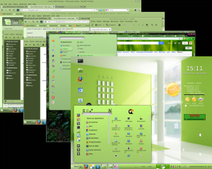
Hey guys gmc85 has uploaded the new Zorin8 Black theme here http://cinnamon-spices.linuxmint.com/themes/view/288 and here http://gnome-look.org/content/show.php/ ... ent=162916 and it looks awesome
-
austin.texas
- Level 20
- Posts: 12003
- Joined: Tue Nov 17, 2009 3:57 pm
- Location: at /home
Re: How To Theme The Cinnamon Taskbar Panel and Window List
Crunchy-green has a nice hover highlight for the window list tabs. It is a simple inset border highlight.
Original code:
.window-list-item-box:hover {
box-shadow: inset 0px 0px 2px 2px rgba(111,174,108,0.3);
border-radius: 2px 2px 0px 0px;
}
change to light green:
.window-list-item-box:hover {
box-shadow: inset 0px 0px 2px 2px #8bbe89;
border-radius: 2px 2px 0px 0px;
}
Change focused tab to have light green inset highlight, instead of gray:
and add bold font:
.window-list-item-box:active,
.window-list-item-box:checked,
.window-list-item-box:focus {
background-gradient-direction: vertical;
background-gradient-start: rgba(111,174,108,0. ; /* dark green */
background-gradient-end: rgba(111,174,108,0.2); /* dark green */
box-shadow: inset 0px 0px 2px 2px rgb(139,190,137); /* make green instead of gray */
border-radius: 2px 2px 0px 0px;
font-weight: bold;
}
And here are the focused and hovered tabs, with the new inset green borders -

Original code:
.window-list-item-box:hover {
box-shadow: inset 0px 0px 2px 2px rgba(111,174,108,0.3);
border-radius: 2px 2px 0px 0px;
}
change to light green:
.window-list-item-box:hover {
box-shadow: inset 0px 0px 2px 2px #8bbe89;
border-radius: 2px 2px 0px 0px;
}
Change focused tab to have light green inset highlight, instead of gray:
and add bold font:
.window-list-item-box:active,
.window-list-item-box:checked,
.window-list-item-box:focus {
background-gradient-direction: vertical;
background-gradient-start: rgba(111,174,108,0.
; /* dark green */background-gradient-end: rgba(111,174,108,0.2); /* dark green */
box-shadow: inset 0px 0px 2px 2px rgb(139,190,137); /* make green instead of gray */
border-radius: 2px 2px 0px 0px;
font-weight: bold;
}
And here are the focused and hovered tabs, with the new inset green borders -
Mint 18.2 Cinnamon, Quad core AMD A8-3870 with Radeon HD Graphics 6550D, 8GB DDR3, Ralink RT2561/RT61 802.11g PCI
Linux Linx 2018
Linux Linx 2018
-
Brahim Salem
Re: How To Theme The Cinnamon Taskbar Panel and Window List
I have created a new group called "Cinnamon+ GTK themes" join us here https://www.facebook.com/groups/720730851278414/ to post your themes and tutorials
-
cecilieaux
- Level 5

- Posts: 742
- Joined: Mon Dec 09, 2013 9:43 am
- Location: Washington, D.C.
Re: How To Theme The Cinnamon Taskbar Panel and Window List
There is no such directory. Should I make it? What do I put on it.austin.texas wrote:You can apply a different color to the panel easily.
Open the theme's cinnamon.css file in /home/user/.themes/MyTheme/cinnamon/ with a text editor - Leafpad and gedit are good, Bluefish is the best, IMHO.
I am using Linux Mint 13 Maya.
C
Cecilieaux
--
Every time I think I'm past newbiedom something like this happens.
Running Linux Mint 21 Vera with Cinnamon.
--
Every time I think I'm past newbiedom something like this happens.
Running Linux Mint 21 Vera with Cinnamon.