yep, that one is outright terrible
Modern Web UI: Like it or loathe it?
Forum rules
Do not post support questions here. Before you post read the forum rules. Topics in this forum are automatically closed 30 days after creation.
Do not post support questions here. Before you post read the forum rules. Topics in this forum are automatically closed 30 days after creation.

Re: Modern Web UI: Like it or loathe it?
I really don't see anything different either so I cannot honestly vote on it. Some sites drive me crazy when the change out advertisements while I am trying to read and the text moves around. I usually just leave the site at that point.
"Tune for maximum Smoke and then read the Instructions".
-
Portreve

- Level 13

- Posts: 4870
- Joined: Mon Apr 18, 2011 12:03 am
- Location: Within 20,004 km of YOU!
- Contact:
Re: Modern Web UI: Like it or loathe it?
On a whim, I just went there to look at it. Most of the time I'm on my phone when I'm looking at news, so the only Google news feed I'm familiar with is the Android-deployed one.
I think their standard web layout is fine. At least it's not all crammed and cramped feeling.
Flying this flag in support of freedom 🇺🇦
Recommended keyboard layout: English (intl., with AltGR dead keys)
Podcasts: Linux Unplugged, Destination Linux
Also check out Thor Hartmannsson's Linux Tips YouTube Channel
Recommended keyboard layout: English (intl., with AltGR dead keys)
Podcasts: Linux Unplugged, Destination Linux
Also check out Thor Hartmannsson's Linux Tips YouTube Channel


Re: Modern Web UI: Like it or loathe it?
BenTrabetere wrote: ⤴Tue Nov 06, 2018 10:51 pm I think Google News is a good example of this "modern" look and what is so wrong with it.
Those are both excellent examples of "modern UI" and the sort of thing I was referring to.
My bank has now turned off the old online site & now we are forced to use the spaced-out "phablet" version, with huge UI elements which look as if they were designed for (or even by) a three-year-old & where all the statement entries now have triple line spacing etc. with no "printer friendly" option.
Older examples are when MS changed their online Outlook layout. Once upon a time it was like a proper desktop application but then they spaced everything out (like the Google News site) so that only five or six emails were visible in the list at any time. Useless. Everything laid out for people with tiny screens and huge fingers, it seems, with no thought for PC & laptop users.
Dell Inspiron 1525 - LM17.3 CE 64-------------------Lenovo T440 - Manjaro KDE with Mint VMs
Toshiba NB250 - Manjaro KDE------------------------Acer Aspire One D255E - LM21.3 Xfce
Acer Aspire E11 ES1-111M - LM18.2 KDE 64 ----… Two ROMS don't make a WRITE …
Toshiba NB250 - Manjaro KDE------------------------Acer Aspire One D255E - LM21.3 Xfce
Acer Aspire E11 ES1-111M - LM18.2 KDE 64 ----… Two ROMS don't make a WRITE …


Re: Modern Web UI: Like it or loathe it?
BLUF (bottom line up front) is not how it looks but is it functional and intuitive.
Old or new really is not the issue for me - rather what the purpose of the site is and how the site is laid out to that end. Also some sites I use on my phone like checking sports scores and breaking news vs. forums. online shopping and banking. I have pretty much eliminated ads with a few add-ons and now with a PiHole (set up on an old Lenovo laptop running LMDE3).
Old or new really is not the issue for me - rather what the purpose of the site is and how the site is laid out to that end. Also some sites I use on my phone like checking sports scores and breaking news vs. forums. online shopping and banking. I have pretty much eliminated ads with a few add-ons and now with a PiHole (set up on an old Lenovo laptop running LMDE3).
-
TL7
Re: Modern Web UI: Like it or loathe it?
So I am not alone.
Maybe, for me, “loathing” is a bit exaggerated. But the legacy versions of many websites looked more desktop-like.
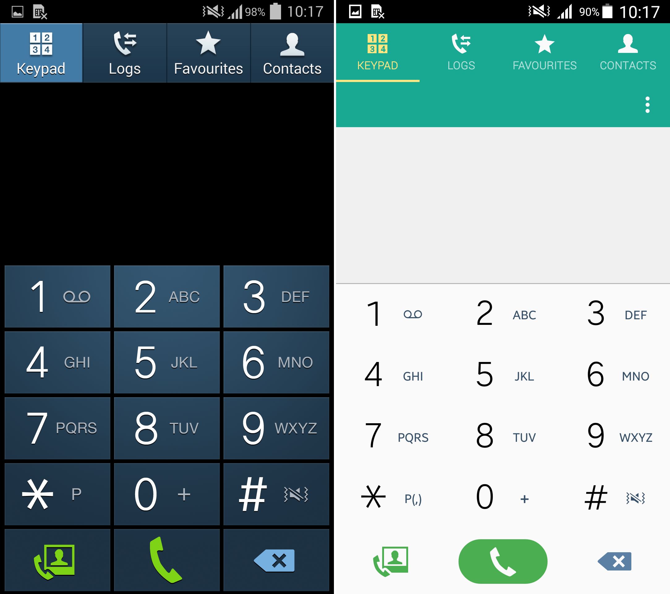
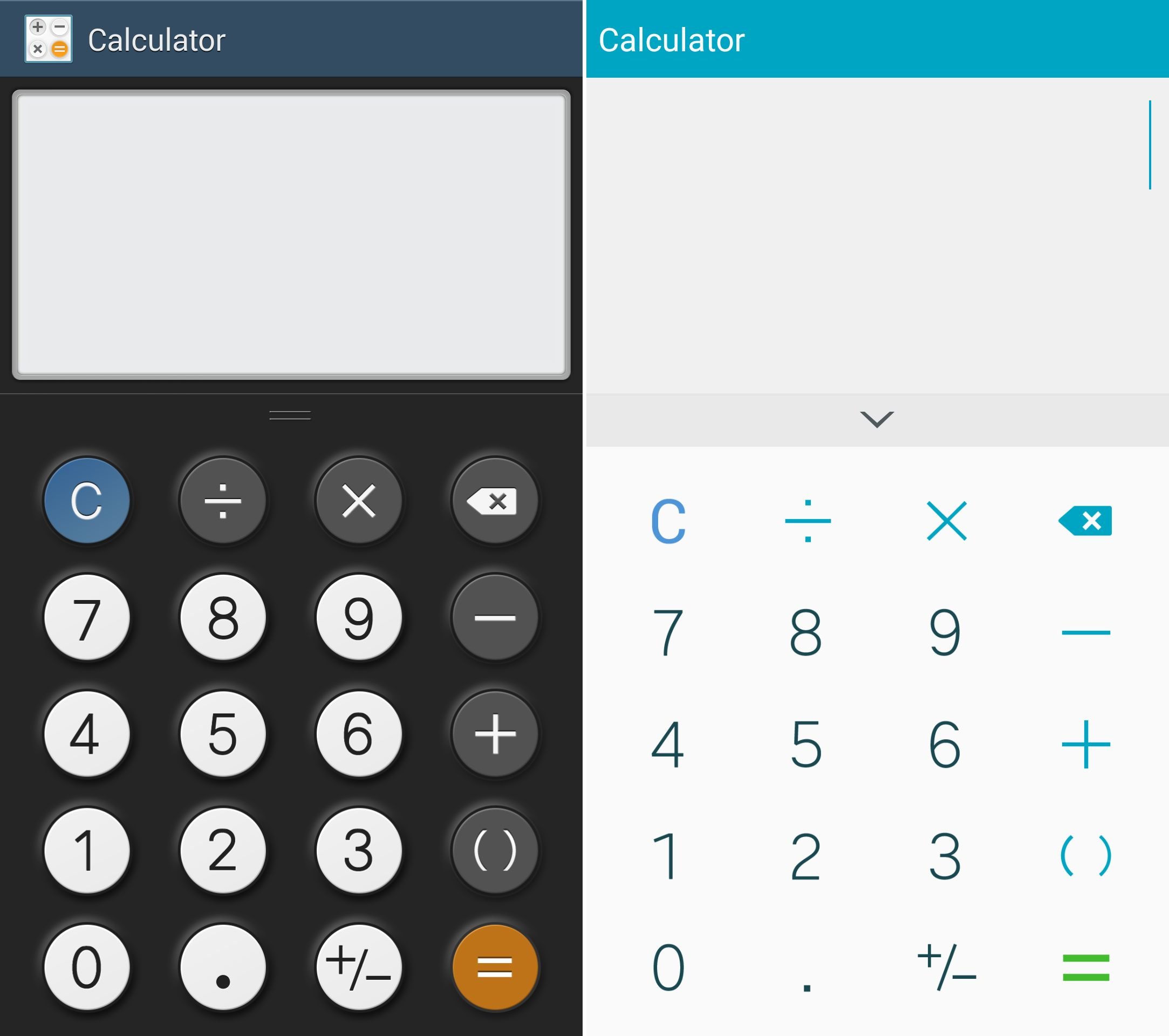
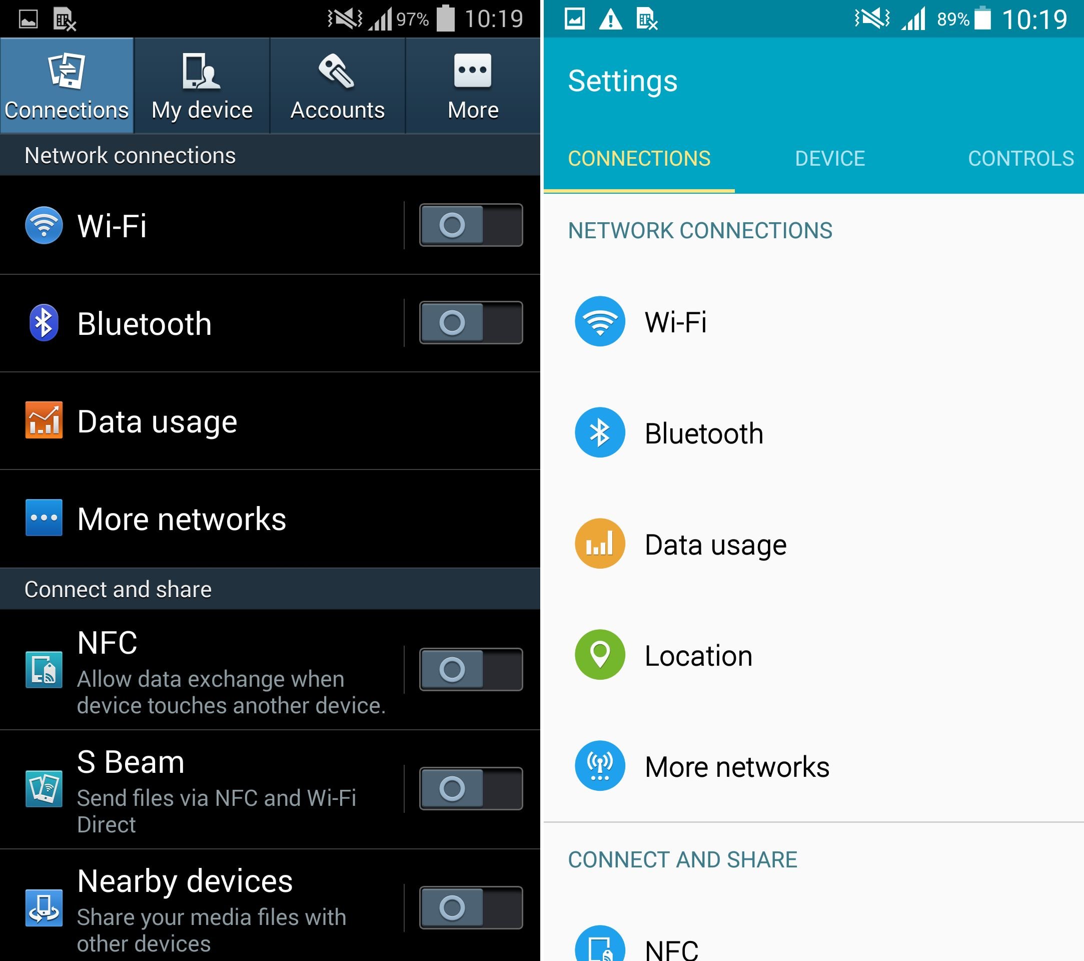
I miss the skeumorphistic design of the past. The modern design trend somehow goes towards websites that look like an animation from the YouTube channel Kurzgesagt – In a Nutshell. Many logos in past lost depth and became flat. The advantage, at least, is that it is easier to manipulate these images in graphic editors. And also saving some kilobytes of data per raster graphic. But logos should use vector graphics anyway. Also user interfaces such as TouchWiz made things a lot flatter in past. The 2013 Samsung phones had metallic camera buttons. In 2014, flattened. Also colour transitions (e.g. on dialogue boxes) turned into single colours and blue, green and orange turned into grey and white. Setting menus since Galaxy S5 and S4,Note 3 with Lollipop upgrade became flat icons in circles instead of individual icons. Borders and edges of UI items are also gone. See:
[*]https://www.sammobile.com/wp-content/up ... ipop-7.jpg
[*]https://static.giga.de/wp-content/uploa ... echner.jpg
[*]https://static.giga.de/wp-content/uploa ... lungen.jpg
[*]Bottomless Android Lollipop quick toggle menu: https://cdn.wccftech.com/wp-content/upl ... ipop-3.jpg
This Quora question has respectible >10000 followers: https://www.quora.com/Why-are-so-many-c ... at-designs .
Google Chrome for Mobile's UI also got a round overhaul recently.
The flat design trend also diminishes contrast in UI elements. Borders are unclear.
In the year 2015, instagram.com's website layout looked as if the mobile page was loaded on first sight. So many elements removed.
And there come rounded profile pictures, another thing many websites copied from each other. The last men standing (2017), Twitter and Facebook, also got caught by that wave.
It would be good if users were given a choice. Some vBulletin forums such as forums.XDA-Developers.com have a stylechooser which maintains legacy website layouts.
For YouTube, there used to be a GreaseMonkey script to convert to the previous layouts and ActionScript v2 video player instead of v3 (flash is deprecated on YouTube today anyway).
I am still able to live with flat and minimal design, although my preference is clearly maximalistic, but when deterioating functionality (removed context menu icons on Galaxy S5 and Samsung phones “upgraded” to Android Lollipop, white menus on Galaxy Note 4 (also S4, Note 3 and S5 with Android Lollipop) and the grand functionality circumcision on Galaxy S6 due to Hyun Yeul Lee's toxic design philosophy), that is not so fine anymore.