
Alright, now for that oh so favorite topic... fonts lol.
So what do YOU use for your favorite fonts?
I use that MS Core Font package from Software Manager for Times New Roman -- which is very nice for Internet browsing and word processing.
For desktop and default, I am using the default Ubuntu fonts -- although, I am not sure if I like this as much as the Segoe UI on Windows 10, but it's fine.
Fonts
Forum rules
Do not post support questions here. Before you post read the forum rules. Topics in this forum are automatically closed 6 months after creation.
Do not post support questions here. Before you post read the forum rules. Topics in this forum are automatically closed 6 months after creation.
-
absque fenestris

- Level 12

- Posts: 4110
- Joined: Sat Nov 12, 2016 8:42 pm
- Location: Confoederatio Helvetica
Re: Fonts
These are now my Firefox settings for Windows 10 - in the Linuxes I use the Ubuntu font instead of the Myriad.
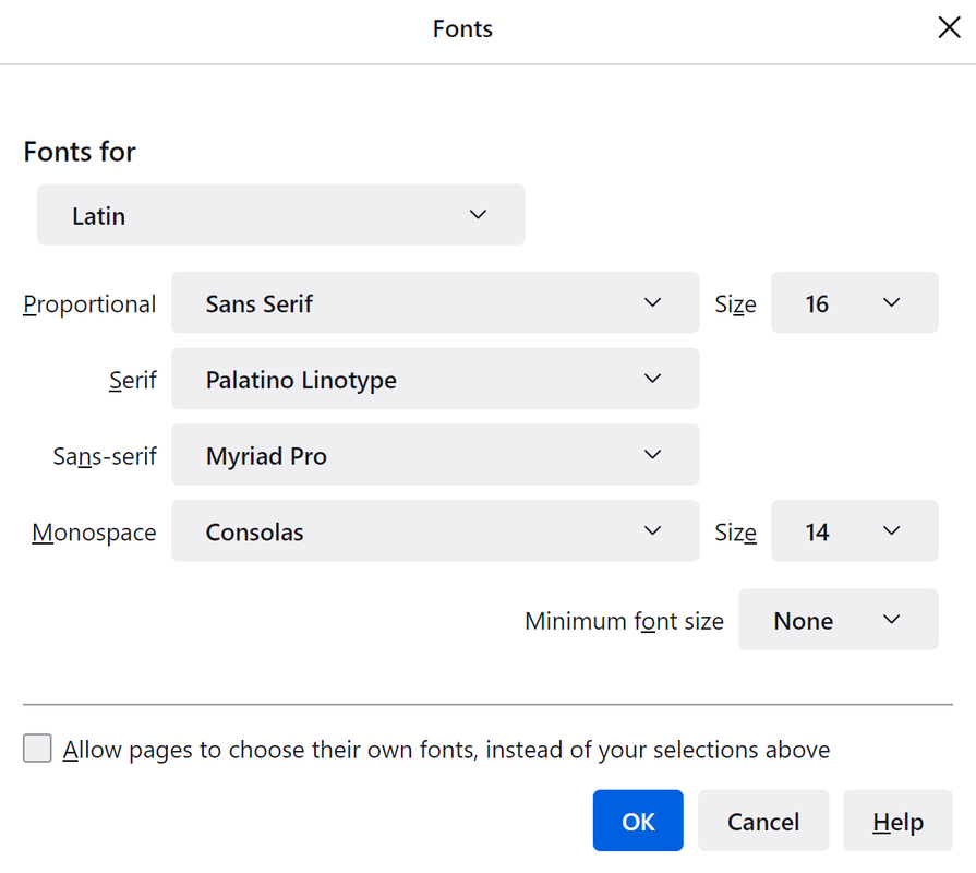
Just by the way, the Ubuntu font is not some hobby work, but was developed by font foundry Dalton Maag for Canonical Ltd. (Ubuntu).
https://en.wikipedia.org/wiki/Ubuntu_(typeface)
https://en.wikipedia.org/wiki/Dalton_Maag
https://www.daltonmaag.com/
Times in all its variations is not one of my preferred fonts - that would be rather fonts like Adobe Caslon, Bembo, Sabon etc. which however look less good on the screen.
The Palatino Linotype, as well as URW-Palladio or TeX Gyre Pagella as open source fonts, meets my requirements for a screen serif quite well.
Screenshot Palatino:

https://en.wikipedia.org/wiki/Palatino
Just by the way, the Ubuntu font is not some hobby work, but was developed by font foundry Dalton Maag for Canonical Ltd. (Ubuntu).
https://en.wikipedia.org/wiki/Ubuntu_(typeface)
https://en.wikipedia.org/wiki/Dalton_Maag
https://www.daltonmaag.com/
Times in all its variations is not one of my preferred fonts - that would be rather fonts like Adobe Caslon, Bembo, Sabon etc. which however look less good on the screen.
The Palatino Linotype, as well as URW-Palladio or TeX Gyre Pagella as open source fonts, meets my requirements for a screen serif quite well.
Screenshot Palatino:
https://en.wikipedia.org/wiki/Palatino

-
absque fenestris
- Level 12
- Posts: 4110
- Joined: Sat Nov 12, 2016 8:42 pm
- Location: Confoederatio Helvetica
Re: Fonts
In my previous post I was just on the road with Windows...
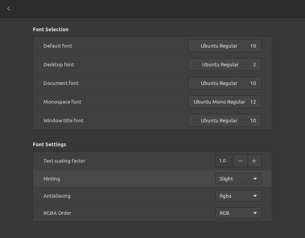
Here my font settings in Mint Cinnamon: in Firefox (and other internet browsers) Ubuntu and Linux Libertine are the fonts of my choice, as the system fonts I also set Ubuntu. (About Palatino / Palladio / P052 > see Addendum)
In general, I find the Ubuntu font very readable on the screen, in my opinion better than what Apple and Microsoft have to offer as system fonts.

a Linux Libertine screenshot:

Addendum:
Both the whole URW Palladio L font family and the P052 Roman font have been broken with nice regularity since Mint 20.0. I'm still trying to figure out what's going on.
On the KDE desktops of Manjaro and Debian, these two font styles work without problems.
Of course, I could switch to the Tex Gyre Pagella, but that still doesn't explain why quite a few of the fonts shipped with Mint are junk.
Here my font settings in Mint Cinnamon: in Firefox (and other internet browsers) Ubuntu and Linux Libertine are the fonts of my choice, as the system fonts I also set Ubuntu. (About Palatino / Palladio / P052 > see Addendum)
In general, I find the Ubuntu font very readable on the screen, in my opinion better than what Apple and Microsoft have to offer as system fonts.
a Linux Libertine screenshot:
Addendum:
Both the whole URW Palladio L font family and the P052 Roman font have been broken with nice regularity since Mint 20.0. I'm still trying to figure out what's going on.
On the KDE desktops of Manjaro and Debian, these two font styles work without problems.
Of course, I could switch to the Tex Gyre Pagella, but that still doesn't explain why quite a few of the fonts shipped with Mint are junk.
Re: Fonts
I think I will try Roboto or Droid for desktop. Some people have been able to adjust those to look just like Mac OS and Android system fonts. In fact, I think Android is Roboto. However, for document font, I like the Mscorefonts Times New Roman. It is very clean and reads well. It has been my go to font since undergrad lol.
Indiana University Alumnus, CompTIA A+

-
absque fenestris
- Level 12
- Posts: 4110
- Joined: Sat Nov 12, 2016 8:42 pm
- Location: Confoederatio Helvetica
Re: Fonts
If ordinary fonts get a bit boring, this can be effectively counteracted with the use of Dingbats ...
New horizons for the Mint Forums:
New horizons for the Mint Forums:

-
absque fenestris
- Level 12
- Posts: 4110
- Joined: Sat Nov 12, 2016 8:42 pm
- Location: Confoederatio Helvetica

-
Portreve

- Level 13
- Posts: 4870
- Joined: Mon Apr 18, 2011 12:03 am
- Location: Within 20,004 km of YOU!
- Contact:
Re: Fonts
A while ago, I fixed the fonts which shipped with Windows Vista and also Office 2007, which still are the current ones these days. As a consequence, when Calibri, Candara, and any of the others are used in a web page or in an MS Office document, everything renders correctly.
Flying this flag in support of freedom 🇺🇦
Recommended keyboard layout: English (intl., with AltGR dead keys)
Podcasts: Linux Unplugged, Destination Linux
Also check out Thor Hartmannsson's Linux Tips YouTube Channel
Recommended keyboard layout: English (intl., with AltGR dead keys)
Podcasts: Linux Unplugged, Destination Linux
Also check out Thor Hartmannsson's Linux Tips YouTube Channel

Re: Fonts
I use
My ~/.config/fontconfig/fonts.conf file has
So I just use "sans", "serif" and "monospace" to tell which font to use. (You can change ALL your fonts by
changing these values in
and for each font, there's another entry like this, although I forget why (browser?) ...
liberation fonts for just about everything (they're actually quite similar to other font sets, croscore and the MS fonts, IIRC).My ~/.config/fontconfig/fonts.conf file has
Code: Select all
<alias> <family>serif</family>      <prefer><family>Liberation Serif</family></prefer> </alias>
<alias> <family>sans-serif</family> <prefer><family>Liberation Sans</family> </prefer> </alias>
<alias> <family>sans</family>       <prefer><family>Liberation Sans</family> </prefer> </alias>
<alias> <family>monospace</family> <prefer><family>Liberation Mono</family> </prefer> </alias>changing these values in
fonts.conf, e.g. set sans to Ubuntu Medium)and for each font, there's another entry like this, although I forget why (browser?) ...
Code: Select all
<match target="pattern">
<test name="family" qual="any"> <string>sans</string> </test>
<edit binding="strong" mode="prepend" name="family"><string>Liberation Sans</string></edit>
</match>
Please edit your original post title to include [SOLVED] if/when it is solved!
Your data and OS are backed up....right?
Your data and OS are backed up....right?
Re: Fonts
LOL! I need and want good looking fonts and icons. Linux just looks old. Which is the complaint my kids have. Perhaps if more people used QT instead of GTK we might have better looking fonts and icons? Nicely anti-aliased, and more Mac like in terms of look?
-
absque fenestris
- Level 12
- Posts: 4110
- Joined: Sat Nov 12, 2016 8:42 pm
- Location: Confoederatio Helvetica
Re: Fonts
Well, Mac-like would work somehow - even with Mint. It's just not the most modern.
But note the summary of the respective font families and the expanded dialer window.
Windows and Linux still can't manage that...

But note the summary of the respective font families and the expanded dialer window.
Windows and Linux still can't manage that...
-
Portreve
- Level 13
- Posts: 4870
- Joined: Mon Apr 18, 2011 12:03 am
- Location: Within 20,004 km of YOU!
- Contact:
Re: Fonts
It took me a minute, but that's Adobe Illustrator you're rocking on that Mac desktop! OMG, I remember that. Good times.absque fenestris wrote: ⤴Sun Jan 30, 2022 12:27 pm Well, Mac-like would work somehow - even with Mint. It's just not the most modern.
But note the summary of the respective font families and the expanded dialer window.
Windows and Linux still can't manage that...
Anyhow, to your point about how they used a hierarchical tree to take you from a font family to the individual installed faces, that is definitely down to how a given desktop environment's developers decided to do things. Actually, there's another factor involved, too...
In the world of fonts, when you actually open them up and explore, what you'll find is there's separate bits of metadata which deal with the family name and with each particular face's name. So, for example, let's say you've got the classical Helvetica you used to find back in the era of your virtual Mac desktop.
Helvetica
> Helvetica Bold
> Helvetica Bold Oblique
> Helvetica
> Helvetica Oblique
However, they used to also do this with the various face names:
Helvetica
> B Helvetica Bold
> BO Helvetica Bold Oblique
> Helvetica
> O Helvetica Oblique
In some of the fonts out there, particularly where they have a LOT of weights, you'll see L for Black, K or W for Book, etc. So, for example, CLBI would refer to a Condensed Black (Bold) Italic weight of a font. There's a lot of little conventions that used to be used. So far as I'm aware, they stopped doing that a very long time ago.
A lot of software, such as Aldus's various titles like PageMaker or Freehand (continued on by Adobe after they bought up Aldus Corporation), QuarkXPress, and others, would let you start typing in the font name field of their respective properties area
bo helv (or whatever) and it would instantly snap to that particular font (in this example, you'd get Helvetica Bold Oblique). If you made use of the keyboard for a lot of these things (and that was actually taken to a high art by Quark with their QuarkXPress program) you could super-rapidly run through all the formatting settings you needed.One thing I definitely do not miss from the old days was font ID conflicts. OMG that used to be so horrible and a nightmare to work around.
Back in the day in what is now called "Classic Mac OS", there used to be ID numbers assigned to the bitmapped font data. What could happen is you might have two completely different fonts which somehow at various points managed to get the exact same ID number assigned, and that would then screw up your ability to use them. Moreover, if you submitted your materials to a local print shop, font ID conflicts could easily cause your job to be printed with the wrong fonts. Oftentimes, print shops would have to keep just a few minimum basic fonts installed on their systems, and then completely change out all the fonts between each different customer's job. There were utilities developed to try and check for this, but nevertheless it added to the workload and was very frustrating to try and track down.
This sort of got dealt with somewhere around System 7.1 or maybe it was 8.0 (I just don't remember any more) but honestly you really didn't have a definitive end to this whole nightmare until Apple transitioned to Mac OS X (now called macOS).
In case anyone might be wondering, the terms italic and oblique are exactly the same thing. By convention, serif fonts use "italic" and sans serif fonts use "oblique".
BTW, if anyone here has copied over the various Microsoft-bundled fonts from a Windows installation to Linux and noticed that several — though curiously not all — fonts don't render correctly, that's because those fonts have contained within the font files themselves basic bitmaps of those fonts, and for whatever reason those get used instead of the outline data. The way to fix this — which is the way I fixed this for myself — is to use FontForge to extract the outline font data from them (they are TrueType fonts, but kept in a single "TrueType Collection" or ".ttc" file) and save them exactly as they are originally named, then create a new .ttc and import just those outlines back into it.
Anyhow, absque fenestris, I completely agree with you that it would be great if the various DEs, as well as software, would use that particular user interface element, because it's a neat, tidy, and very efficient way to directly pick which font face you want. I think it would help clean up the font picker portions of all the various programs out there.
Flying this flag in support of freedom 🇺🇦
Recommended keyboard layout: English (intl., with AltGR dead keys)
Podcasts: Linux Unplugged, Destination Linux
Also check out Thor Hartmannsson's Linux Tips YouTube Channel
Recommended keyboard layout: English (intl., with AltGR dead keys)
Podcasts: Linux Unplugged, Destination Linux
Also check out Thor Hartmannsson's Linux Tips YouTube Channel
-
absque fenestris
- Level 12
- Posts: 4110
- Joined: Sat Nov 12, 2016 8:42 pm
- Location: Confoederatio Helvetica
Re: Fonts
To answer possible questions about the above, somewhat antique Mac OS system:
A certain Mr. Felix Rieseberg made a little joke and let an emulated Quadra 1991 run via JavaScript on any current system.
For those interested: https://github.com/felixrieseberg/macintosh.js/

A certain Mr. Felix Rieseberg made a little joke and let an emulated Quadra 1991 run via JavaScript on any current system.
For those interested: https://github.com/felixrieseberg/macintosh.js/
Re: Fonts
I just installed the Roboto package from Software Manager and that looks the best to me for default, desktop, and windows. Liberation Serif is close enough to Times New Roman, but I still use that Ttf pack on Libreoffice for compatibility purposes with other MS Word documents.
Update:
On lower resolution screens, Roboto (unhinted) from the metapackage doesn't work as well -- with or without instructions; however, on a higher resolution screen, it works. The same thing with the Noto fonts. This all said, the default Ubuntu fonts and instructions are fine for most.
Update:
On lower resolution screens, Roboto (unhinted) from the metapackage doesn't work as well -- with or without instructions; however, on a higher resolution screen, it works. The same thing with the Noto fonts. This all said, the default Ubuntu fonts and instructions are fine for most.
Last edited by Agentl074 on Wed Feb 23, 2022 1:12 pm, edited 1 time in total.
Indiana University Alumnus, CompTIA A+
-
RollyShed

- Level 8

- Posts: 2438
- Joined: Sat Jan 12, 2019 8:58 pm
- Location: South Island, New Zealand
- Contact:
Re: Fonts
MurphCID, why aren't you using Runes? Today someone at the Shed was checking up on them and about to write a notice with them. I told him not to waste printer ink but go and get a hammer and chisel.
MS and free equal fonts -
Calibri = Carlito and Caladea = Cambria, these are Google fonts which are identical to the MS fonts and free.
For a screen I find a sans serif font easier and on paper serifed fonts. The absolute worst on screen is not the fonts used but the blackness. Some websites the letters are so light grey as to make them unreadable.
The next worst thing, often on paper too, is something like dark yellow print on brown or similar such that again, unreadable.
Re: Fonts
If you speak with the guys I work with they would agree that I write in Runic. Also they claim my first issued duty weapon was a flintlock.RollyShed wrote: ⤴Mon Feb 07, 2022 4:22 am MurphCID, why aren't you using Runes? Today someone at the Shed was checking up on them and about to write a notice with them. I told him not to waste printer ink but go and get a hammer and chisel.
MS and free equal fonts -
Calibri = Carlito and Caladea = Cambria, these are Google fonts which are identical to the MS fonts and free.
For a screen I find a sans serif font easier and on paper serifed fonts. The absolute worst on screen is not the fonts used but the blackness. Some websites the letters are so light grey as to make them unreadable.
The next worst thing, often on paper too, is something like dark yellow print on brown or similar such that again, unreadable.