New design for the Linux Mint Forums: UserCSS ready to use! Try this FreshMint!

Suggestions and feedback for Linux Mint and the forums
Forum rules
Do not post support questions here. Before you post read: Where to post ideas & feature requests
User avatar
SMG
Level 25
Level 25
Posts: 32007
Joined: Sun Jul 26, 2020 6:15 pm
Location: USA

Re: New design for the Linux Mint Forums: UserCSS ready to use! Try this FreshMint!

Post by SMG »

sebastjava wrote: Sat Mar 16, 2024 4:47 pmI had some trouble with the style for these forum rules. I already had made an exception for the quotes and codes, using a light touch of blue colors for those, because otherwise there was too much of green colors. So, now, I had whites, blacks, grays, greens, and blues. I didn't want any other colors.
I personally look for functionality first. Color schemes are secondary to being able to easily read text and view controls.

Different colors show differently depending upon the monitor and its backlight. I think muted colors are best for the most heavily read text while brighter colors should be for emphasis. Too much emphasis is jarring to the eyes so colors hitting the neon spectrum I do not consider to be ideal.

Additionally, I use a small laptop so making the header a larger size is just more scrolling I have to do to get to the text. I would think that would be worse for those using phones (which many people do when they are having issues with their laptops).
sebastjava wrote: Sat Mar 16, 2024 4:47 pm No pink or red. Otherwise it would start looking like a Christmas tree.
You are using quite bright greens and blues so it looks "lit up" to me even without red. I find it harder to read because of the minimal palette and bright colors you selected.

If your intent was to follow the Linux Mint website then I don't understand making the logo and fonts different. They should be the same. Additionally, you seem to have put a lot more emphasis on blue than is on the main website.

People come to the forum to get help with problems. They want pages to load fast and be easy to read. They are not here for an artistic palette.
Image
A woman typing on a laptop with LM20.3 Cinnamon.
User avatar
sebastjava
Level 5
Level 5
Posts: 714
Joined: Wed Jun 28, 2017 8:01 pm
Location: Montréal, Québec, Canada
Contact:

Re: New design for the Linux Mint Forums: UserCSS ready to use! Try this FreshMint!

Post by sebastjava »

SMG wrote: Mon Mar 18, 2024 9:58 pm I personally look for functionality first. Color schemes are secondary to being able to easily read text and view controls.
I don't try to make things functional OR nice looking. I make them both nice AND functional. Colors are chosen for their significance, eye comfort, harmony, color contrasts, etc. Color contrast means readability. I try to follow the contrast requirements as stated by the W3C.
SMG wrote: Mon Mar 18, 2024 9:58 pm Different colors show differently depending upon the monitor and its backlight.
Well, they shouldn't. All monitors should be well color-calibrated. But the backlight is something that needs to be re-adjusted regularly, depending on the environment. If I was facing the sun, I would set it up to 100% intensity, but now, at night, my backlight is reduced to 50%. That's just common sense, nothing sophisticated there.
SMG wrote: Mon Mar 18, 2024 9:58 pm Too much emphasis is jarring to the eyes so colors hitting the neon spectrum I do not consider to be ideal.
I was asked to use the exact same colors as for the main website. I did. I only changed the direction and the starting and ending points. Otherwise things were a bit too subtle, IMHO. But the colors are still exactly the same.

Image

I find it strange that, for the main website, you are saying it is a great professional thing, but for everything I do, it is bad. Very, very bad. I guess that's because I am doing it for free. If you prefer, I could charge 100 000 $, and then you would say "wow, that's professional !"
SMG wrote: Mon Mar 18, 2024 9:58 pm Additionally, I use a small laptop so making the header a larger size is just more scrolling I have to do to get to the text. I would think that would be worse for those using phones (which many people do when they are having issues with their laptops).
On your desktop, that's 165 pixels vs 149 pixels height. That's not a big difference. It could be changed, of course. But here again, I could compare with the main website. There you've got hundreds, thousands of empty pixels, gigantic margins, and nobody complains about this being too "artistic". Nobody... except me. There are too much empty spaces on the first page, i.e. the landing page, on the main website, IMHO. I like big margins, yes, but that's just too much.

On the cellular phones, there is absolutely no difference. The page headers are both at the same 108 pixels height. And I manage to put your logo in there, while there is no logo at all on the Minty theme, on the cellular phones.
SMG wrote: Mon Mar 18, 2024 9:58 pm If your intent was to follow the Linux Mint website then I don't understand making the logo and fonts different.
I was asked to do the same as the recently updated main website and blog. The problem here is that the main website and the blog don't share the exact same styles. So, I felt free to improvise. Additionally, technically I needed a variable weight font. This Exo2 font is a variable weight font. I tried using a variable weight Ubuntu font before, but I had some troubles in trying to use it.

SMG wrote: Mon Mar 18, 2024 9:58 pm People come to the forum to get help with problems. They want pages to load fast and be easy to read. They are not here for an artistic palette.
Well, that's a good point. A very good one. I am convinced that there are lots of people who just look at these forums, and just run away. This really helps in making sure the servers are not overloaded, and thus the pages will load fast, when there isn't some buggy advertisement.
The future Linux Mint Forums is here.
Self-Appointed Benevolent Designer on Linux Mint Cinnamon.
Image
dave0808
Level 5
Level 5
Posts: 987
Joined: Sat May 16, 2015 1:02 pm

Re: New design for the Linux Mint Forums: UserCSS ready to use! Try this FreshMint!

Post by dave0808 »

sebastjava wrote: Mon Mar 18, 2024 11:35 pm
SMG wrote: Mon Mar 18, 2024 9:58 pm Different colors show differently depending upon the monitor and its backlight.
Well, they shouldn't. All monitors should be well color-calibrated. But the backlight is something that needs to be re-adjusted regularly, depending on the environment. If I was facing the sun, I would set it up to 100% intensity, but now, at night, my backlight is reduced to 50%. That's just common sense, nothing sophisticated there.
Good luck with that!

I would bet that most people don't even know that their monitors can be adjusted, especially the hue. And if they're using a phone, well asides from the auto-brightness, that's just a little harder, depending on device and O/S.

Just look at people's TVs. Some adjust it for daytime viewing garish and bright, some for nighttime movies, some for sports. Warm, neutral, cold. Different content and different preferences.
User avatar
SMG
Level 25
Level 25
Posts: 32007
Joined: Sun Jul 26, 2020 6:15 pm
Location: USA

Re: New design for the Linux Mint Forums: UserCSS ready to use! Try this FreshMint!

Post by SMG »

sebastjava wrote: Mon Mar 18, 2024 11:35 pmAll monitors should be well color-calibrated. But the backlight is something that needs to be re-adjusted regularly, depending on the environment. If I was facing the sun, I would set it up to 100% intensity, but now, at night, my backlight is reduced to 50%. That's just common sense, nothing sophisticated there.
I agree with dave0808's comments on this and will not repeat them.
sebastjava wrote: Mon Mar 18, 2024 11:35 pmI was asked to use the exact same colors as for the main website. I did. I only changed the direction and the starting and ending points. Otherwise things were a bit too subtle, IMHO.
Subtle is good for having to read a lot.
sebastjava wrote: Mon Mar 18, 2024 11:35 pmI find it strange that, for the main website, you are saying it is a great professional thing, but for everything I do, it is bad. Very, very bad.
Where did I say that? I said it does not appear that you were consistent with what is on the main website.
sebastjava wrote: Mon Mar 18, 2024 11:35 pmI guess that's because I am doing it for free. If you prefer, I could charge 100 000 $, and then you would say "wow, that's professional !"
No, I would not say that. Paying for something does not make it automatically better in my view.
sebastjava wrote: Mon Mar 18, 2024 11:35 pmOn your desktop, that's 165 pixels vs 149 pixels height. That's not a big difference.
Thank you for dismissing my concerns because you are on a big screen and those pixels do not make a difference to you.
sebastjava wrote: Mon Mar 18, 2024 11:35 pmBut here again, I could compare with the main website.
The main website has a different purpose than the forum website. There is much less information to be conveyed than on the forum website so that is not a good comparison.
sebastjava wrote: Mon Mar 18, 2024 11:35 pmAnd I manage to put your logo in there, while there is no logo at all on the Minty theme, on the cellular phones.
What is "my logo"? I don't have a logo.
sebastjava wrote: Mon Mar 18, 2024 11:35 pmI was asked to do the same as the recently updated main website and blog. The problem here is that the main website and the blog don't share the exact same styles. So, I felt free to improvise.
So you went off and made a third style?
sebastjava wrote: Mon Mar 18, 2024 11:35 pmI am convinced that there are lots of people who just look at these forums, and just run away.
Yes, you do seem convinced of that even though there is no logic at all to that.

I spend a lot of time here approving first posts and helping others and I think your conviction is extremely inaccurate. People not using Linux Mint come here for help because the forum members have such a great reputation for helping others.
Image
A woman typing on a laptop with LM20.3 Cinnamon.
t42
Level 11
Level 11
Posts: 3747
Joined: Mon Jan 20, 2014 6:48 pm

Re: New design for the Linux Mint Forums: UserCSS ready to use! Try this FreshMint!

Post by t42 »

Suggested new look is carefully designed with a lot of thought but I absolutely dislike it. I understand its aesthetic but is foreign to me and I don't think such color gamut is appropriate for the technical forum. Maybe it is just trying to draw attention of random visitors. Current Forum design has its small problems but its aesthetic is not intrusive and it not creates destruction.
-=t42=-
User avatar
sebastjava
Level 5
Level 5
Posts: 714
Joined: Wed Jun 28, 2017 8:01 pm
Location: Montréal, Québec, Canada
Contact:

Re: New design for the Linux Mint Forums: UserCSS ready to use! Try this FreshMint!

Post by sebastjava »

You have too many arguments. I am overwhelmed. I am sorry, I can't answer them all.

I did read them all. I can agree, to some extent, to some of them. There is a new FreshMint version coming up.

My "to do" list:
  1. icon colors: #69B53F
  2. rules BG: #0B6BCB ? or #E61B4E ?
  3. buttons corners and colors
  4. page header height

SMG wrote: Tue Mar 19, 2024 10:01 am
sebastjava wrote: Mon Mar 18, 2024 11:35 pmI was asked to use the exact same colors as for the main website. I did. I only changed the direction and the starting and ending points. Otherwise things were a bit too subtle, IMHO.
Subtle is good for having to read a lot.
We are only talking about the page header and the forum categories here. That's the logo and just a few anchors. We are not talking about the backgrounds on all the topics and posts, nor the topics and forums lists, nor anything else. That's not "reading a lot".

You could have seen all this, in real life. You just had to install the Stylus extension, then this FreshMint. But you did not. You are just looking at one screenshot. I am not going to make screenshots to show you every part of these forums, there would be too many.

Again, as said before, this Stylus add-on would let you instantly switch on or off this FreshMint theme, so you could easily, instantly compare with your "professional", "standard" Minty theme.

I am aware that the future of this FreshMint is uncertain, since it does not have unanimous approval, but I still see things to improve. There is a mountain of work behind this, and I usually finish what I start. However, rest assured, I won't bother you again after this.
The future Linux Mint Forums is here.
Self-Appointed Benevolent Designer on Linux Mint Cinnamon.
Image
User avatar
SMG
Level 25
Level 25
Posts: 32007
Joined: Sun Jul 26, 2020 6:15 pm
Location: USA

Re: New design for the Linux Mint Forums: UserCSS ready to use! Try this FreshMint!

Post by SMG »

sebastjava wrote: Wed Mar 20, 2024 1:09 pm
SMG wrote: Tue Mar 19, 2024 10:01 amSubtle is good for having to read a lot.
We are only talking about the page header and the forum categories here.
I am also talking about all the topic names. They come across as an extremely bright blue. Additionally, the contrast of that color with the darker (of the two alternating backgrounds) is less than what we currently have which to me makes it harder to read. I don't need to install add-ons to my browser to see what I can see in the screenshot. I'd likely be installing some type of filter to tone down the colors so it would be easier to read if that was the direction the forum headed.
sebastjava wrote: Wed Mar 20, 2024 1:09 pmThere is a mountain of work behind this...
Yes, there is. I understand that.

There are a lot of things in life into which I have put a lot of work which needed rework if it was ever going to be used. That's part of understanding how the feedback cycle works when one does work in a team environment.
Image
A woman typing on a laptop with LM20.3 Cinnamon.
User avatar
sebastjava
Level 5
Level 5
Posts: 714
Joined: Wed Jun 28, 2017 8:01 pm
Location: Montréal, Québec, Canada
Contact:

Re: New design for the Linux Mint Forums: UserCSS ready to use! Try this FreshMint!

Post by sebastjava »

version 2.5.0 changelog:
  • FreshMint.user.css: button colors (+gradients)
  • page-header height = 150 px (±1 px)
  • rules BG color: #E61B4E
  • "unread" icons color: #69B53F
  • etc.
The two first images on OP (top) will always show the latest screenshots.

The gradient color on the page header is similar to the one found on the Linux Mint's main website.

main website's page header:

Code: Select all

background: linear-gradient(150deg, #69B53F 0%, #2AB9A5 100%);
FreshMint's page header:

Code: Select all

background: linear-gradient(90deg, #69B53F 33%, #2AB9A5 67%)
That's the exact same color values, but with different angles and different starting and ending points. Compare images: website-vs-forums.

The page-header now has the same height (±1 px) as the current Minty theme.

Rules colors: Some members of the LM team had specifically asked me to make the rules more visible, attention-grabbing.

README and learn all about this FreshMint.

Also available on:
https://userstyles.world/style/14785/freshmint
https://userstyles.world/style/15109/freshmint-dark
The future Linux Mint Forums is here.
Self-Appointed Benevolent Designer on Linux Mint Cinnamon.
Image
User avatar
sebastjava
Level 5
Level 5
Posts: 714
Joined: Wed Jun 28, 2017 8:01 pm
Location: Montréal, Québec, Canada
Contact:

Re: New design for the Linux Mint Forums: UserCSS ready to use! Try this FreshMint!

Post by sebastjava »

I have some doubt about the rules background color. This "red pink" background color, here on version 2.5.0.

You want it to stand out. It should be quite "vibrant". It can't be gray. It can't be green either, because it must be of a different color. A boldly different one. But this red pink might be a bit "too much".

As suggested earlier, a blue background color might be a better choice:

FreshMint-rules-redpink-vs-blue.png

Red refers to important or dangerous. Blue refers to law or royal. Both red pink or blue could work for the rules background color. But I think I would prefer blue, as it is not so much "out of place", it fits better with the green and green-blue colors here. And it isn't so "hot" and "vibrant", while still being quite noticeable...
The future Linux Mint Forums is here.
Self-Appointed Benevolent Designer on Linux Mint Cinnamon.
Image
User avatar
SMG
Level 25
Level 25
Posts: 32007
Joined: Sun Jul 26, 2020 6:15 pm
Location: USA

Re: New design for the Linux Mint Forums: UserCSS ready to use! Try this FreshMint!

Post by SMG »

sebastjava wrote: Fri Mar 22, 2024 4:16 pmThe gradient color on the page header is similar to the one found on the Linux Mint's main website.
I personally think having the color only change in the corners is easier on the eyes instead of splitting the page in half with the left half being green and the right half being blue.
sebastjava wrote: Fri Mar 22, 2024 4:16 pm The page-header now has the same height (±1 px) as the current Minty theme.
Thank you.
sebastjava wrote: Fri Mar 22, 2024 6:06 pmYou want it to stand out. It should be quite "vibrant".
"Vibrant" and "stand out" are not the same thing. Vibrant appears to be what you have done with all the colors. I find them overly bright.

When researching issues I spend a lot of time on other forums and if you check Nvidia Developer Forum - Linux, Debian, ArchLinux, Manjaro, AskUbuntu and others you will find muted colors. That's the norm and is easier on the eyes for reading large amounts of text.
sebastjava wrote: Fri Mar 22, 2024 4:16 pmRed refers to important
Correct. That is why they currently are a shade of red. Blue does not indicate "important" especially with quite a bit of blue already on the page.
Image
A woman typing on a laptop with LM20.3 Cinnamon.
User avatar
sebastjava
Level 5
Level 5
Posts: 714
Joined: Wed Jun 28, 2017 8:01 pm
Location: Montréal, Québec, Canada
Contact:

Re: New design for the Linux Mint Forums: UserCSS ready to use! Try this FreshMint!

Post by sebastjava »

I want to try to answer each of your points, but first I try to find a more general philosophical explanation. Why is it so difficult? I listen to all the comments and understand much of it. So the last positive comment makes me see things positively, while the last negative comment makes me see things negatively.

Design involves personal judgment. There is not only artistic improvisation here, there are also, sometimes, standards that I try to respect, sometimes. Standards set by professionals. But sometimes the standards diverge and contradict each other, from one source to another. So there are personal choices to make.

I sometimes hesitate to change things, because this FreshMint already inherits a history of "do" and "don't". This FreshMint is the descendant of another project, an ancestor: Prosilver-lm. I had already had some feedback from Clem and Xenopeek on Prosilver-lm. On Slack and on private messages.
Re: PRE-RELEASE: Prosilver-lm forum theme

I'm sure it's a nice looking theme. It doesn't look to match the color palette of the main website https://linuxmint.com/ or the blog https://blog.linuxmint.com/. Those are the websites that most recently got a redesign. If we'd go with a different theme for the forums I think Clem would want to go with a color palette at least somewhat in line with those two. —Xenopeek, private message, Sun Mar 05, 2023
So, there is already a long history of experimentation and communications behind this FreshMint. First, of course, there are all the previous versions of FreshMint which led to this version 2.5.0. But there is also the whole story of this ancestor, Prosilver-lm, which preceded all that. We see a small part of it here: https://github.com/SebastJava/prosilver ... er/preview

Examples taken from https://github.com/SebastJava/prosilver ... er/preview:


Image
Nice fresh green background on the logo, combined with a subdued "Greeny blue" for better readability.


Image
All posts here share the same white background, and you can still clearly see the separations between them, with this darker overall body background (#E8E8E8) and 3X margins, here at 12 px.


I don't remember getting any positive feedback on those. Things like this can explain the more conservative approach taken here on this newer FreshMint. This FreshMint is the result of numerous and sometimes contradictory requirements. So, I was asked to take on the colors of the main website and the blog. But the colors are not the same between these two sites. So I chose the main website as a reference. But, then again, I encountered problems.

The main website is based on a professionally designed template: Wizixo. The problem is that, according to W3C standards, some elements lack sufficient contrast in this Wizixo template. I am talking about contrasts with white text on green backgrounds, and vice-versa. It should be at least 3.0, or much better, 4.5, or excellent at 7 and up. But not all the way up to 21, of course. Color contrasts are measured with tools such as this https://colorable.jxnblk.com/, or this https://marijohannessen.github.io/color ... t-checker/ or this Flatpak Contrast application, available right here in your Software manager.

So, I chose to use the color gradient in the header more or less as found on the 
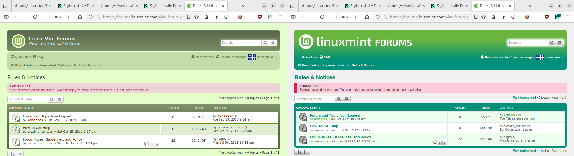
main website, "vibrant" and of rather low contrast with the foreground white text, because I consider that the contrasts in there are not so important, since there is not much reading to be done in there. That's only for the logo and a few words. Again, I was told to come up with a color palette somewhat similar to the main website, and that's what I tried. In fact, I had the exact same precise values, but felt I had to improvise on those. On the other hand, for the massive amount of titles and links found everywhere else, I chose colors which are very different from those of this Wizixo template. Colors that have much more pronounced contrasts, to be more readable. You could consider that Wizixo's pale green links can work on the main website, because the text is significantly larger there. But it doesn't work for the forums. The text is too small. I must admit that most of the contrasts on the current forums are good. I therefore set myself the objective of making it prettier, and more comprehensive, functional, and without neglecting contrasts and readability. Altogether, as always.

With the exception of the colors on the header, which are pretty, but which lack some contrast with the white text, and which are rather “vibrant”. Once again, I repeat that these colors are the result of a compromise between what was asked of me, and what I thought was good. I had already proposed some less “vibrant”, darker and more contrasting colors for the header, in the ancestor of FreshMint, this Prosilver. But the feedback was not unanimously positive. And then, at a certain point, I no longer had any answers.

Clem and Xenopeek had cut off all communications with me. They now no longer respond. I guess I behaved badly. Maybe the problem is I don't always do exactly what is asked from me. Or maybe the problem is that I offered too many choices, too often. Or something else. It was not explained to me why communications were suddenly broken.

In any case, this breakup, and this time elapsed between the Prosilver project and this new FreshMint, all that explains my attitude. Sometimes I do pretty much what was asked from me, in search of approval, and sometimes I take initiative, in order to meet other requirements, such as contrast standards or personal preferences.

The core of the problem

But I think I'm getting to the core of the problem here: I have personal opinions and preferences. Design is first and foremost an artist’s affair. It's personal work. It doesn't fit anywhere here in this community.

And I find it very difficult and laborious to have each element collectively approved one by one, especially since element B depends on element A, and element C depends on B, and after having revised and approved A, B and C, it will be necessary to revise A again, since A depends on C... And so on. And it would take one week or one month to get each element approved...

But I still tried that, this “collective design” approach. Maybe that's why Clem and Xenopeek left... There was tons of proposals and they had more important things to do...

And then, maybe there's something else underneath all this...

I started trying to contribute with my personal vision to the design of Linux Mint in 2018. I was more “kiddy and unprofessional” at the time. I think I have gained some knowledge and experience since that time. But perhaps the bad impressions resulting from my beginnings have remained anchored in your memories.

And I know there are people who are not happy with the changes made to the logo and the GTK colors. I wasn't the one who made these changes, but I may have been a small part of this wind of change.

Speaking of wind, it's the spring wind that is starting to appear here in my country. It's time for me to go out.

P.S.: I forgot to answer any of your points, on this preceding post here. That's for my next post, coming soon. This second one should be short and concise.
The future Linux Mint Forums is here.
Self-Appointed Benevolent Designer on Linux Mint Cinnamon.
Image
User avatar
sebastjava
Level 5
Level 5
Posts: 714
Joined: Wed Jun 28, 2017 8:01 pm
Location: Montréal, Québec, Canada
Contact:

Re: New design for the Linux Mint Forums: UserCSS ready to use! Try this FreshMint!

Post by sebastjava »

SMG wrote: Sun Mar 24, 2024 8:33 pm I personally think having the color only change in the corners is easier on the eyes instead of splitting the page in half with the left half being green and the right half being blue.
As already explained, this is some sort of compromise I tried. We are only talking about the page header and forum categories here. I tried different things before in this previous Prosilver-lm project, and all these other proposals got rejected, or just radically ignored. So, now I don't have any other idea, for these page header and forum categories. And, BTW, that right half is not really "blue", that's just #2AB9A5 = "Tealish", according to Gpick.
SMG wrote: Sun Mar 24, 2024 8:33 pm "Vibrant" and "stand out" are not the same thing.
We are talking about this red pink background on the forum rules link on top of every forums page. I was asked to put emphasis on this. I can agree to say it certainly got a strong emphasis, it is now really attention-grabbing. Maybe too much, yes. I just don't know what to do with this one. Here again, many things were tried before, and they all got rejected. The status quo didn't work either, as I remember. I'll keep thinking about this...
SMG wrote: Sun Mar 24, 2024 8:33 pm Vibrant appears to be what you have done with all the colors. I find them overly bright.
I can't understand how you could see "vibrant" colors everywhere. You are not using this FreshMint theme, so I guess you are only looking at the main preview on the OP, this one:

Image

In there, apart from the 2 or 3 elements we've already talked about, I don't see any color that could be called "vibrant". Not in this image, nor anywhere else. Additionally, I don't see any blue color anywhere in this image.

So, maybe you are referring to this ultra-light green for the background on every odd element in the list: 1st, 3rd, etc. That's not "vibrant". Gpick calls it "Off white". This one here: #EFFFEF.

Or maybe you are talking about this dark turquoise-green color on the titles and links? That's not "vibrant", IMHO. Really not. That's my custom, carefully crafted color. This one was hard to choose. This one here: #007D69. It took months before I finally came with this one. That's nice, it fits, and it is much better contrasted than most other green colors found on "professional" sites. Greater than 4.5 color contrast ratio on a #F2F2F2, light gray background. Test it here: https://colorable.jxnblk.com/

Again, sorry about that, Clément. Our project leader asked me for green links, and I stubbornly continued to search for the right shade of blue, for reasons of contrast and readability. That was a long time ago, on this old Prosilver-lm project. But I finally found this #007D69 at the beginning of this FreshMint, before the first publication. And I still haven't changed my mind since.
SMG wrote: Sun Mar 24, 2024 8:33 pm (...) Blue does not indicate "important" especially with quite a bit of blue already on the page.
I can't find any blue color on this page. There is this #007D69 and this #2AB9A5. When in doubt, I check Gpick to see how those colors could get named: "Blue green" and "Tealish", respectively, according to Gpick. That's the only blueish colors in there, on the OP 1st screenshot. But I did use some dark aqua-blue color for the quotes and code blocks. Only on the borders. I needed something different.

● ● ●

Again, I can agree about the rules background color. It steals the show, as they say. I should try something else, sometime later.

This FreshMint was intended to transfer the task of reworking colors over and over to your side. By creating variables that are easy to change, through a GUI, on your screen. But you refuse to install this Stylus extension, despite being officially approved by the Firefox team.

So I'm still stuck managing everything myself. And this forum here is not very representative, it is difficult to organize a vote on each element. So I allow myself to judge what needs to be changed or not. This would work better on GitHub or Slack, because there you can vote on each post with a simple thumbs up or thumbs down.

Anyway, I guess you can just forget this. It is not getting any official support. Besides, if it ever got uploaded on the Linux Mint servers, it wouldn't be hard to keep both the old and the new themes. You would just have to go to your user control panel to choose your preferred theme.

P.S.: when I say "you", I sometimes refer to the team. Please do not take these comments on a personal level. No personal offense here. And the bold highlights are mostly used as a substitute for subtitles. Or... to compensate for these low-contrast, faded links, here on your preferred Minty theme...
The future Linux Mint Forums is here.
Self-Appointed Benevolent Designer on Linux Mint Cinnamon.
Image
User avatar
sebastjava
Level 5
Level 5
Posts: 714
Joined: Wed Jun 28, 2017 8:01 pm
Location: Montréal, Québec, Canada
Contact:

Re: New design for the Linux Mint Forums: UserCSS ready to use! Try this FreshMint!

Post by sebastjava »

IMHO, if you want the forum rules to be noticeable, to stand out, then you need a strong, saturated color. Some red or pink red. Ex.: #E61B4E. It could be red on white, or white on red, or else, black on white with a thick pink red border:

Rules-colors-and-borders.png

But this takes 5px + 5px = 10px more vertical space... It should be a thick border. I was going to choose a 4px border, and then changed to 5px to match the thickness of the green border right next to it.
The future Linux Mint Forums is here.
Self-Appointed Benevolent Designer on Linux Mint Cinnamon.
Image
User avatar
sebastjava
Level 5
Level 5
Posts: 714
Joined: Wed Jun 28, 2017 8:01 pm
Location: Montréal, Québec, Canada
Contact:

Re: New design for the Linux Mint Forums: UserCSS ready to use! Try this FreshMint!

Post by sebastjava »

Or this?
Rules-colors-and-borders-2.png
The future Linux Mint Forums is here.
Self-Appointed Benevolent Designer on Linux Mint Cinnamon.
Image
User avatar
sebastjava
Level 5
Level 5
Posts: 714
Joined: Wed Jun 28, 2017 8:01 pm
Location: Montréal, Québec, Canada
Contact:

Re: New design for the Linux Mint Forums: UserCSS ready to use! Try this FreshMint!

Post by sebastjava »

version 2.6.0 changelog:
  • rules styled like quotes (12px border on the left and subtle background color)
The two first images on OP will now always show the latest screenshots.

FreshMint (light) is the main and most refined version.
FreshMint-dark is a bit more experimental.

README and learn all about this FreshMint.

Also available on:
https://userstyles.world/style/14785/freshmint
https://userstyles.world/style/15109/freshmint-dark
The future Linux Mint Forums is here.
Self-Appointed Benevolent Designer on Linux Mint Cinnamon.
Image
User avatar
sebastjava
Level 5
Level 5
Posts: 714
Joined: Wed Jun 28, 2017 8:01 pm
Location: Montréal, Québec, Canada
Contact:

Re: New design for the Linux Mint Forums: UserCSS ready to use! Try this FreshMint!

Post by sebastjava »

version 2.6.1 changelog:
  • 4 square corners on rules box
  • inline-code border color and CSS order
The two first images on OP will now always show the latest screenshots.

FreshMint (light) is the main and most refined version.
FreshMint-dark is a bit more experimental.

README and learn all about this FreshMint.

Also available on:
https://userstyles.world/style/14785/freshmint
https://userstyles.world/style/15109/freshmint-dark
The future Linux Mint Forums is here.
Self-Appointed Benevolent Designer on Linux Mint Cinnamon.
Image
User avatar
SMG
Level 25
Level 25
Posts: 32007
Joined: Sun Jul 26, 2020 6:15 pm
Location: USA

Re: New design for the Linux Mint Forums: UserCSS ready to use! Try this FreshMint!

Post by SMG »

sebastjava wrote: Tue Mar 26, 2024 6:15 pmAnd this forum here is not very representative....
Apparently, you don't realize just how out of touch with reality that statement is. Saying the people who use the forum are not really a good representation to give feedback on what works for them as they use this forum is condescending.
sebastjava wrote: Tue Mar 26, 2024 6:15 pm... to compensate for these low-contrast, faded links, here on your preferred Minty theme...
So this is why our eyeballs are hurting with your color selections.
sebastjava wrote: Tue Mar 26, 2024 6:15 pm
SMG wrote: Sun Mar 24, 2024 8:33 pm (...) Blue does not indicate "important" especially with quite a bit of blue already on the page.
I can't find any blue color on this page.
Perhaps you should read your own words then.
sebastjava wrote: Fri Mar 22, 2024 6:06 pmAs suggested earlier, a blue background color might be a better choice:

FreshMint-rules-redpink-vs-blue.png
You are the one who suggested blue because it fits in with your preferred color scheme.

And for someone who claims to be an artist, you not understanding teal, turquoise, and aqua are in the blue spectrum just emphasizes your unwillingness to consider ideas that are not your own inventions.
sebastjava wrote: Tue Mar 26, 2024 2:31 pmBut I think I'm getting to the core of the problem here: I have personal opinions and preferences. Design is first and foremost an artist’s affair. It's personal work. It doesn't fit anywhere here in this community.
There are basic artistic and design principles upon which all can agree. In fact those principles are what is taught in art schools across the world. It is not "an artist's affair". You deciding your personal opinion should override what has been requested means it is your project and not something for the community. That's fine. Enjoy your project.

I will have no further comments on this topic.
Image
A woman typing on a laptop with LM20.3 Cinnamon.
InvisibleRasta
Level 1
Level 1
Posts: 15
Joined: Mon Apr 01, 2024 9:50 am

Re: New design for the Linux Mint Forums: UserCSS ready to use! Try this FreshMint!

Post by InvisibleRasta »

Thank you very much for your work. I have been using the dark style for months and it makes my browsing experience on this "dated look" forum much better. I didn't know there was actually a post about it on the forum. Just stumbled upon it today and tought to come by and thank you about your work.
Keep it up
User avatar
sebastjava
Level 5
Level 5
Posts: 714
Joined: Wed Jun 28, 2017 8:01 pm
Location: Montréal, Québec, Canada
Contact:

Re: New design for the Linux Mint Forums: UserCSS ready to use! Try this FreshMint!

Post by sebastjava »

InvisibleRasta wrote: Sun Apr 14, 2024 1:01 pm Thank you very much for your work. I have been using the dark style for months and it makes my browsing experience on this "dated look" forum much better. (...)
Thank you for your positive comments. It's very appreciated.
sebastjava wrote: Thu Mar 28, 2024 9:42 am FreshMint (light) is the main and most refined version.
FreshMint-dark is a bit more experimental.
There is probably still some work to do, on this dark variant. But I don't have time for this right now. I will be busy elsewhere for several months... Nothing to worry about. This FreshMint-dark is okay. I was just thinking of fine tuning some colors in it, maybe, later.
The future Linux Mint Forums is here.
Self-Appointed Benevolent Designer on Linux Mint Cinnamon.
Image
Infidelus
Level 4
Level 4
Posts: 274
Joined: Mon Feb 25, 2019 3:14 pm
Location: United Kingdom

Re: New design for the Linux Mint Forums: UserCSS ready to use! Try this FreshMint!

Post by Infidelus »

I did actually try the dark version for a few weeks but ended up going native again as the colour combination was starting to hurt my eyes. I'd still like to see a dark mode though so hopefully I will test again at some time in the future.
Gaming exclusively on Linux since 2017. Windows can suck it!
Post Reply

Return to “Suggestions & Feedback”