

That's an opinion and it doesn't match mine. I feel that these suggestions are not helping with anything in any way. But knock yourself out, if it makes you happy. *shrug*
Linux Mint logo suggestion
Forum rules
Topics in this forum are automatically closed 6 months after creation.
Topics in this forum are automatically closed 6 months after creation.
Re: Linux Mint logo suggestion

If your issue is solved, kindly indicate that by editing the first post in the topic, and adding [SOLVED] to the title. Thanks!
-
harfad
Re: Linux Mint logo suggestion
-
harfad
Re: Linux Mint logo suggestion
Any of the above are better than the current "LM" logo! 
I suggest that they should pick a few by general agreement that they like best, and put it to the vote of the forum members. Then they don't need to use the exact stock image. They can use it as suggestions or inspiration for a final logo design.
I suggest that they should pick a few by general agreement that they like best, and put it to the vote of the forum members. Then they don't need to use the exact stock image. They can use it as suggestions or inspiration for a final logo design.
-
gm10
Re: Linux Mint logo suggestion
Personally I think this should be closed down for spamming at this point but that's just my opinion. I'm sure there's thousands of stock graphics and photos of leaves out there, so I guess we'll be here a while. Maybe we could also post pictures of the letters LM in all posible fonts. *shrug* indeed.
-
harfad
Re: Linux Mint logo suggestion
Linux folks are good at tech, but hopeless at artistic talent. Your post proves my point.gm10 wrote: ⤴Tue Jul 30, 2019 6:44 amPersonally I think this should be closed down for spamming at this point but that's just my opinion. I'm sure there's thousands of stock graphics and photos of leaves out there, so I guess we'll be here a while. Maybe we could also post pictures of the letters LM in all posible fonts. *shrug* indeed.
Re: Linux Mint logo suggestion
As far as I know, there is already a chosen designer working on an actual new logo.
If your issue is solved, kindly indicate that by editing the first post in the topic, and adding [SOLVED] to the title. Thanks!
-
harfad
Re: Linux Mint logo suggestion
Good to hear. All designers need good ideas to work with. The more suggestions they get from different people, the more likely they are to come up with the best possible design. That is how all designers work. If you ask any professional designer to design a logo or something else for you, he/she will ask you for some suggestions. Then they will work on it and come up with several different ideas of their own, and ask you which ones you like best, and continue to work like that. I have had professional designers design things for me, and that is how they work. There is nothing wrong with presenting them with ideas.
-
gm10
Re: Linux Mint logo suggestion
Oh, but I'm just as good at google image search as you. Here, let me show you, I submit two Mint Leaf Beetles for your kind artistic consideration:

Last edited by gm10 on Tue Aug 06, 2019 5:39 am, edited 1 time in total.
-
harfad
Re: Linux Mint logo suggestion
Silly post! My favorite image is probably this one:
. .
And it doesn't need any "LM" written on it. Window's logo just looks like a "window". It doesn't need to have "W" written on it for people to figure out that is supposed to represent a window!

Re: Linux Mint logo suggestion
This one has something old and something new and lots of green. You might need to increase the height of your panel if using this as the Menu icon. 

Proper credit goes to this site (although they may have stolen it from elsewhere): https://www.pinclipart.com/maxpin/iRTTmxw/
Proper credit goes to this site (although they may have stolen it from elsewhere): https://www.pinclipart.com/maxpin/iRTTmxw/

-
gm10
Re: Linux Mint logo suggestion
Seems a good size. We should also make the animated Tux cursor for Mint (https://www.gnome-look.org/p/999807) the default to go with that:

Last edited by gm10 on Tue Aug 06, 2019 5:39 am, edited 1 time in total.
-
harfad
Re: Linux Mint logo suggestion
The problem with that image is that by the time it is reduced in size to fit on the panel, there is little visible in it to associate it with "Mint". It may be a good generic logo for "Linux," but not a good logo for "Mint".MrEen wrote: ⤴Tue Jul 30, 2019 5:21 pm This one has something old and something new and lots of green. You might need to increase the height of your panel if using this as the Menu icon.
Proper credit goes to this site (although they may have stolen it from elsewhere): https://www.pinclipart.com/maxpin/iRTTmxw/
Re: Linux Mint logo suggestion
That's perfect! I tried to vote for that one, but couldn't find the polling booth.gm10 wrote: ⤴Tue Jul 30, 2019 6:24 pmSeems a good size. We should also make the animated Tux cursor for Mint (https://www.gnome-look.org/p/999807) the default to go with that:

-
harfad
Re: Linux Mint logo suggestion
.
Here is my second suggestion for a new Linux Mint start menu logo design. It is based on the VectorStock image shown. Nothing wrong with borrowing good ideas from other people, provided you give them due credit. Putting it on a dark background makes it look even better:
.
Here is my second suggestion for a new Linux Mint start menu logo design. It is based on the VectorStock image shown. Nothing wrong with borrowing good ideas from other people, provided you give them due credit. Putting it on a dark background makes it look even better:
.


Re: Linux Mint logo suggestion
If it ain't broke............
Fully mint Household
Out of my mind - please leave a message
Out of my mind - please leave a message
-
harfad
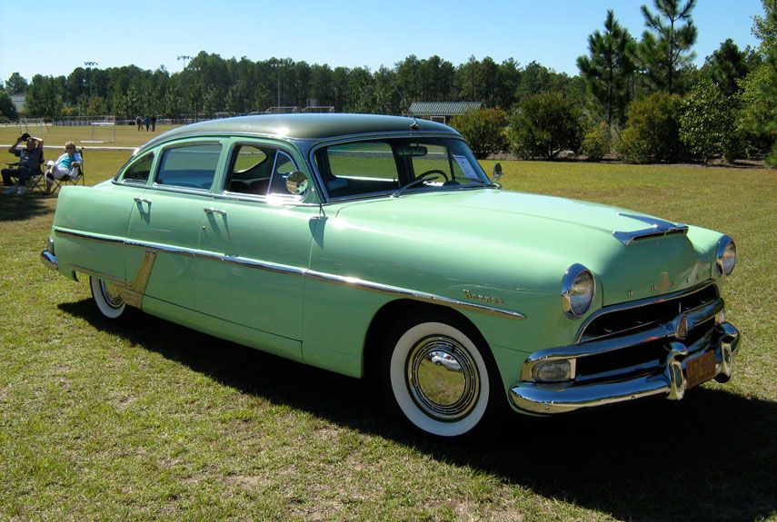
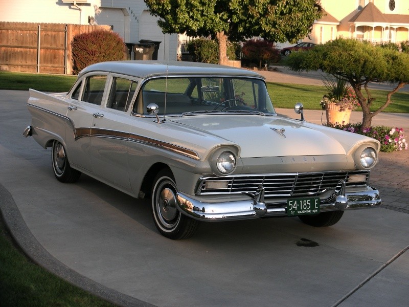
Re: Linux Mint logo suggestion
Good thing everybody doesn't think like that, or we would still be driving cars that look like these:
https://e14ac3ae4ec062172607-c9fe783c22 ... 7e0a64.jpg
https://hips.hearstapps.com/pop.h-cdn.c ... 485934.jpg
https://cdn-w.v12soft.com/photos/IGuDQp ... 800600.jpg
LOL!
Re: Linux Mint logo suggestion
If you don't want them, I'll take them all off your hands!!harfad wrote: ⤴Fri Aug 02, 2019 6:36 amGood thing everybody doesn't think like that, or we would still be driving cars that look like these:
https://e14ac3ae4ec062172607-c9fe783c22 ... 7e0a64.jpg
https://hips.hearstapps.com/pop.h-cdn.c ... 485934.jpg
https://cdn-w.v12soft.com/photos/IGuDQp ... 800600.jpg
LOL!