Linux Mint Logo Redesign

Submit your artwork to make Linux Mint look better
Forum rules
Topics in this forum are automatically closed 6 months after creation.
Locked
maa2020
Level 1
Level 1
Posts: 7
Joined: Sun Aug 01, 2021 7:23 am

Linux Mint Logo Redesign

Post by maa2020 »

Hi!

I am a graphic designer, specializing in logo design.
I use Mint on my laptop and I always thought that there are a few irregularities with the mint logo.
So I tried to redesign it and make it a little bit more professional and cohesive.

Image

This is much more professional in my opinion and also the iconic leaf makes a comeback, but in a more coherent way.
Also there are a lot of more smaller refinements that make the logo more balanced overall.

Image

I also changed the color to a more minty one.
Here it is, inversed and in black and white.

Image

Also about the circle around the logo, I really think it is not needed if the logo itself is adjusted a little.
This way it is more visible as the icon for the menu, website favicon, etc.
Here is a preview in the cinnamon desktop.

Image

I also refined the cinnamon menu a little.

I'd really like to hear your thoughts.
Last edited by LockBot on Wed Dec 28, 2022 7:16 am, edited 1 time in total.
Reason: Topic automatically closed 6 months after creation. New replies are no longer allowed.
maa2020
Level 1
Level 1
Posts: 7
Joined: Sun Aug 01, 2021 7:23 am

Links and Files

Post by maa2020 »

This is the link of the imgur gallery:
(Every image I have posted in this topic is here)

https://imgur.com/a/ePSqMsB

Here is the complete svg package of the design:

Mint.zip
(16.63 KiB) Downloaded 269 times

Also here is a comparison for the cinnamon image:

https://cdn.knightlab.com/libs/juxtapos ... a7ff2ee17c

I will edit this post and more things if needed.
Last edited by maa2020 on Thu Oct 07, 2021 7:59 am, edited 2 times in total.
csandrade87
Level 1
Level 1
Posts: 12
Joined: Tue May 26, 2020 3:40 pm

Re: Linux Mint Logo Redesign

Post by csandrade87 »

Very nice!
maa2020
Level 1
Level 1
Posts: 7
Joined: Sun Aug 01, 2021 7:23 am

Re: Linux Mint Logo Redesign

Post by maa2020 »

csandrade87 wrote: Wed Oct 06, 2021 7:46 pm Very nice!
Thank you!
maa2020
Level 1
Level 1
Posts: 7
Joined: Sun Aug 01, 2021 7:23 am

Re: Linux Mint Logo Redesign

Post by maa2020 »

CtrlAltDel wrote: Wed Oct 06, 2021 9:11 pm It looks GREAT, maa, and I'm sure everyone is pleased that Mint has people that care enough to take time to create a new logo for Mint. But, in a thread just under this one, gugalcrom also created another logo and promoted it and got rave reviews from posters in the thread and was then told, in no uncertain terms, that his contribution just wasn't needed at this time. Gugalcrom's logo was very nice also, just as yours is.

See here:

https://github.com/linuxmint/brand-logo/pull/3

CleMint says:
Please don't change the logo. This project isn't about exploring new alternatives
The thing is, is a change being asked for at this time? Frankly, and not to be rude, but a thousand different iterations of the Mint logo could likely be created that look very pleasing and there could be a rotation of logos every day or every month or every time another one came along. That wouldn't bode too well in the area of continuity though.

When CleMint stated that "this project" isn't about exploring new alternatives, I have to be honest and state that I'm not really sure if he was being narrowly specific about that particular GitHub project or just overall he wasn't interested in a new logo.

Either way, I'm not aware of a hard push being applied to creating a new and official logo right now. At some point, you just have to go with what you have. Microsoft's logo or Ubuntu's logo or Fedora's logo, etc... could all be theoretically improved but, what is the point?

This:

Image

looks good to me. What's wrong with a circle? Besides, the logo was just changed to what it is now. It's a new logo that was created to eliminate many of the issues that the asymmetrical leaf design presented when sizing it down. Having said all that, I'm going to take your logo and plug it into my system here and there because I really like it.
Thank you for your kind words.
Thanks for bringing that link to my attention, I really hope that CleMint was talking about the github project. :(

I wanted to say that the current logo is a big improvement in my opinion but it has some issues.
To demonstrate them, I made this picture.

Image

What's wrong with the circle?
Circles are usually used when the logo needs to have a boundary in a specific use case, like when making an app icon, in print, illustrations, etc.
It makes the logo smaller, where it shouldn't be small, for example in the favicon or the menu button in cinnamon .
It's better not to make it a part of the logo, it should be a variation if it's needed, not the main logo variant.
Just imagine if the apple logo had a circle around it!

About the leaf, I think it's a really good element and it's such a shame that it's a separate one.
Being a separate variant limits where and when it can be used.
If it's integrated into the logo, it would be used everywhere the logo is used and it would make the logo much more consistent in different places.
These two issues (the ring and the leaf) are why linux mint has so many variations.

Image

Just look at this screenshot of the new website.
It's confusing when you have so many variations.

Image

Do microsoft, fedora or ubuntu have so many variations? No.
It makes the branding very inconsistent.
If someone wants to promote mint, which one should they use?
This redesign changes the number of variations from 11 to 2! Because there is no need for a ring, a high badge, or a separate leaf logo, and adds just one variant to the monochrome one, the colored logo.

Just because it was changed recently, it doesn't mean it cannot be changed and you are stuck with it.
If there is a good enough reason for change, which in this case I think there is, you should do it.
In fact, it's better too change it sooner, the sooner you change it, the sooner people will adapt to it.
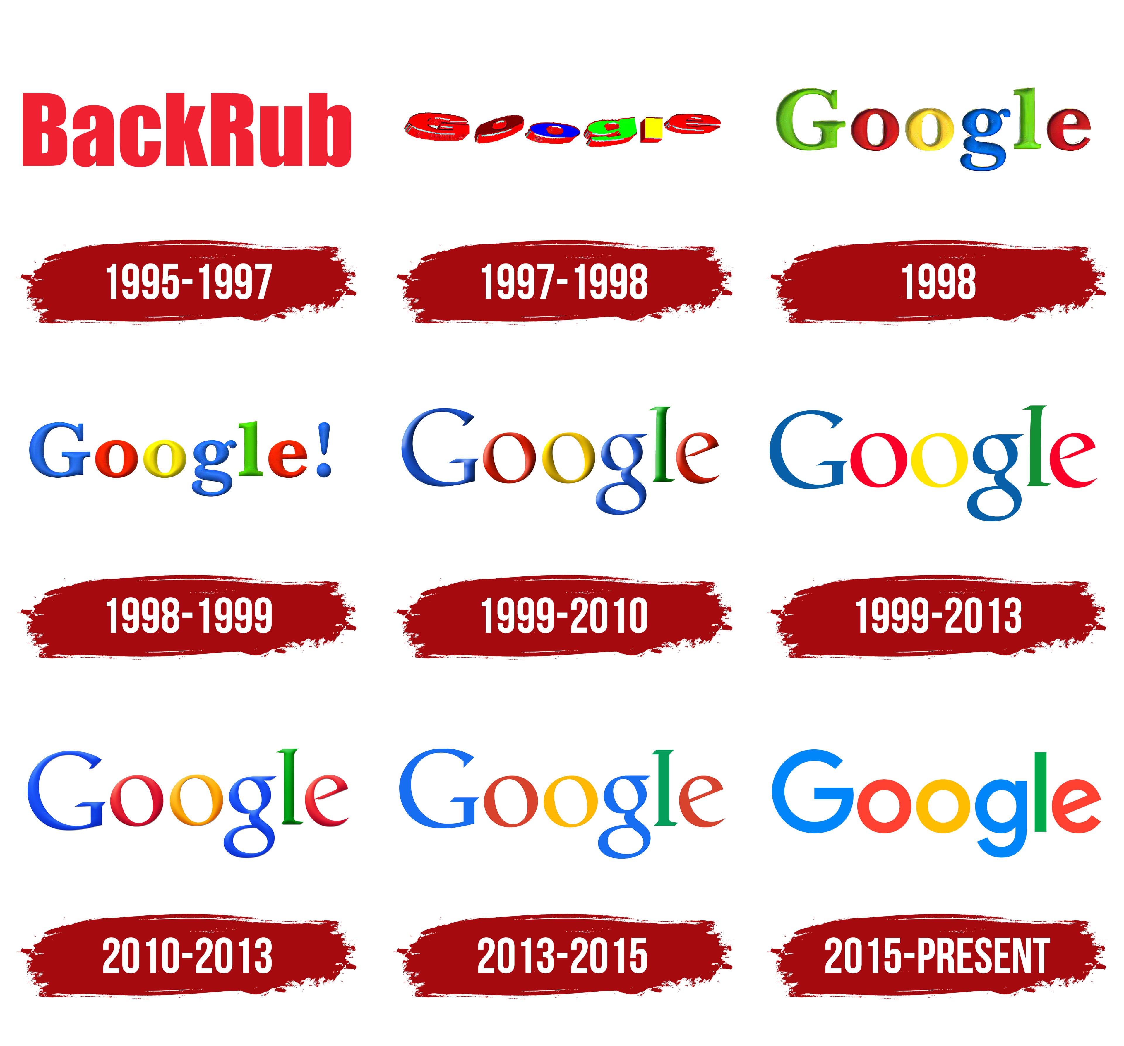
Look at this image. Even google had multiple logos that were used just for a few years.
Image
maa2020
Level 1
Level 1
Posts: 7
Joined: Sun Aug 01, 2021 7:23 am

Re: Linux Mint Logo Redesign

Post by maa2020 »

CtrlAltDel wrote: Thu Oct 07, 2021 4:23 am Image

You have made very convincing arguments as to how it is not a huge deal to change logos and many others do it routinely and you are clearly very talented. You've won me over. If truly professional graphic designers see a need for a change, who am I to disagree?

I'm rooting for you now and maybe your creations will be seen by someone that can effect change. :D
Thank you very much!

But I have to say some things,

First, graphic design is very subjective. A design that looks pleasing to someone might be unbearable to someone else. That's why I want to hear people's thoughts and opinions about my design. Just because I'm a graphic designer by trade doesn't mean what I say about a design is right and others are wrong if they disagree. Someone might hate the things I design and someone might love them, but it doesn't mean any of them are right or wrong.
If the majority of the people who see this design don't like it, it doesn't mean that they don't know anything about graphics, it means that I, as a graphic designer, failed to satisfy the majority of the community. A graphic design, like a logo, poster, book, etc is for people, if they don't like it, then what's the purpose?

Second, to be honest, if anyone addresses the main issues with the current logo, even with just a tiny refinement rather that a redesign, I would be happy.
I personally use linux mint and I really like it. That's why I designed this logo as a hobby project (That's why it needs some little tweaks here and there, and it's not presented professionally :D). I just wanted to demonstrate a different design and give other people and the devs some ideas to explore. I won't be sad if some parts of it get rejected, in fact, I won't be sad if it gets rejected entirely. I don't push for it to replace the current design completely (the logo, logotype, color, etc), but if some small parts of if end up being implemented and help increase linux mint's popularity, I would become very happy.
User avatar
sebastjava
Level 5
Level 5
Posts: 714
Joined: Wed Jun 28, 2017 8:01 pm
Location: Montréal, Québec, Canada
Contact:

Re: Linux Mint Logo Redesign

Post by sebastjava »

Very nice. I approximately agree about pretty much everything you said.

I would only have a small hesitation over colour. (Again !) Your colour is already much better than the official #86BE43. But i think i would prefer something around 160°-170° hue. Maybe #00BE8D ?

Too bad the team is way too busy on many other things and they just don't want to change the logo... There are currently at least two "official" logos. This old one here on top of this forum page ▲, dating from year 2007, and the new one on top of the main website: https://linuxmint.com/.

Well, at least the new one is not bad... And this old one here will be replaced, one day...
The future Linux Mint Forums is here.
Self-Appointed Benevolent Designer on Linux Mint Cinnamon.
Image
maa2020
Level 1
Level 1
Posts: 7
Joined: Sun Aug 01, 2021 7:23 am

Re: Linux Mint Logo Redesign

Post by maa2020 »

sebastjava wrote: Thu Oct 07, 2021 11:45 am Very nice. I approximately agree about pretty much everything you said.

I would only have a small hesitation over colour. (Again !) Your colour is already much better than the official #86BE43. But i think i would prefer something around 160°-170° hue. Maybe #00BE8D ?

Too bad the team is way too busy on many other things and they just don't want to change the logo... There are currently at least two "official" logos. This old one here on top of this forum page ▲, dating from year 2007, and the new one on top of the main website: https://linuxmint.com/.

Well, at least the new one is not bad... And this old one here will be replaced, one day...
Thanks!
I agree about the color. Actually the color I chose first was #22B488 rather than the one I went with here (#3CB478) because that's much closer to a minty color.
But I changed it to a more green one, since the new website's palette was still more green rather than mint, I didn't want the design to be even more of a dramatic change than it already is.
But if it was in my hands, I would absolutely make it more of a mint color. (Which is the name of the distro, so it makes sense).

Here is a comparison of the first color I chose and the final one.

Image
User avatar
sebastjava
Level 5
Level 5
Posts: 714
Joined: Wed Jun 28, 2017 8:01 pm
Location: Montréal, Québec, Canada
Contact:

Re: Linux Mint Logo Redesign

Post by sebastjava »

Yes, this #22B488 is better. Also, just expressing another of my personal preferences, i would change this #E1E1E1 to... pure white: #FFFFFF. More contrast ! Let it shine !
The future Linux Mint Forums is here.
Self-Appointed Benevolent Designer on Linux Mint Cinnamon.
Image
maa2020
Level 1
Level 1
Posts: 7
Joined: Sun Aug 01, 2021 7:23 am

Re: Linux Mint Logo Redesign

Post by maa2020 »

sebastjava wrote: Thu Oct 07, 2021 1:09 pm Yes, this #22B488 is better. Also, just expressing another of my personal preferences, i would change this #E1E1E1 to... pure white: #FFFFFF. More contrast ! Let it shine !
Well, I don't want to blast everyone's eyes out! :D
There are two reasons for not using pure white:
First, I want people to see the design itself better, if it's too bright, it would become a little hard to stare at it and carefully examine it.
Second, my eyes are sensitive to light so I turn it down a notch so it doesn't bother me.
But now that you pointed it out, I remembered that I forgot to unhide the background layer for white images which made the background #E1E1E1, oh well... :D
User avatar
sebastjava
Level 5
Level 5
Posts: 714
Joined: Wed Jun 28, 2017 8:01 pm
Location: Montréal, Québec, Canada
Contact:

Re: Linux Mint Logo Redesign

Post by sebastjava »

maa2020 wrote: Wed Oct 06, 2021 5:04 pm [...]I'd really like to hear your thoughts.[...]
You are saying lots of things and I can't reply to everything... And, anyway, this is just talking because it seems there are not much people willing to change this logo again. And yes, I agree with most of the people: the current new one, the circular one on the new main website, is not bad. There is no urgent need to make a change. But I would like to see this old logo from 2007 replaced by the new one.

Me too, I was not satisfied with the old logo from 2007, the one you still see here today on top of these forum pages, and I tried to change it. That was back in October 2018: VOTE ! Mint-Y-LOGO... A New Version Of The Linux Mint Logo !.

As I already said here, your logo is much better. If your logo had been the official logo, I guess I never would have felt the need to change it. I had also searched the web about the LinuxMint logo, back in 2018. Why were there so many people to come up with some other logo proposals ? Obviously because there were many unsatisfied people. By the way, the method you used here reminds me a bit of the one from Troken, created a long time ago and hard to find today.

Your logo may not be my top most favourite, but I must admit it is one of the good ones. And, technically, when I look at your SVG code, it is very pure. Most of the others are not so pure. So, I like the logo itself, but I am not so sure about the lettering. Maybe your lettering would be better with the Oxanium font: https://fonts.google.com/specimen/Oxanium It just fits. And the kerning is good with this Oxanium font.
maa2020 wrote: Wed Oct 06, 2021 5:04 pm [...]I also changed the color to a more minty one.[...]
Yes ! I never liked this greyish yellow-green.
maa2020 wrote: Thu Oct 07, 2021 3:22 am [...] About the leaf, I think it's a really good element and it's such a shame that it's a separate one. [...]
Sorry, but i disagree with that. I want this original shape from 2007 to disappear, totally. You can read my thoughts about this old logo there: https://github.com/SebastJava/linuxmint ... and-again-
maa2020 wrote: Thu Oct 07, 2021 3:22 am [...] Do Microsoft, Fedora or Ubuntu have so many variations? No.
It makes the branding very inconsistent. [...]
Yes ! That is so true. I think the same. And we are not the only ones. IdrisTheDragon was saying the same thing on Slack. Secret-chest was also saying there are too many logo variants, on GitHub. But I am saying we should only keep some of the new ones, thus not so many variants, and definitely delete the old one from 2007. And I don't like this "new" flat version with that same old shape from 2007. Not at all.
maa2020 wrote: Thu Oct 07, 2021 3:22 am [...] Just because it was changed recently, it doesn't mean it cannot be changed and you are stuck with it. [...] Even google had multiple logos that were used just for a few years. [...]
Yes !

● ● ●

The logo is an important part of the collective identity. A neatly crafted logo will help inspire excellence in all other contributions.

And more broadly, a neat image, which includes the logo and the websites, will go a long way to increasing LinuxMint's reach and growing the community. More money. More contributions. Fewer bugs. More people.

And then, maybe it would help too if there weren't 100 different distros: lots of little groups scattered around, with programmers on one side and designers on the other.
The future Linux Mint Forums is here.
Self-Appointed Benevolent Designer on Linux Mint Cinnamon.
Image
User avatar
gugalcrom123
Level 3
Level 3
Posts: 168
Joined: Tue Mar 30, 2021 4:13 am
Location: Romania
Contact:

Re: Linux Mint Logo Redesign

Post by gugalcrom123 »

Still. My logo is better. It is balanced, dosen't look futuristic, it is calm, it has a realistic mint color, and it dosen't change the LM glyph we all know and love.
New logo suggestion by me

Image

My website
User avatar
Moem
Level 22
Level 22
Posts: 16238
Joined: Tue Nov 17, 2015 9:14 am
Location: The Netherlands
Contact:

Re: Linux Mint Logo Redesign

Post by Moem »

gugalcrom123 wrote: Fri Feb 18, 2022 8:21 am Still. My logo is better.
You've dug up an old thread just to blow your own horn? :roll:
Image

If your issue is solved, kindly indicate that by editing the first post in the topic, and adding [SOLVED] to the title. Thanks!
User avatar
gugalcrom123
Level 3
Level 3
Posts: 168
Joined: Tue Mar 30, 2021 4:13 am
Location: Romania
Contact:

Re: Linux Mint Logo Redesign

Post by gugalcrom123 »

Moem wrote: Fri Feb 18, 2022 9:05 am
gugalcrom123 wrote: Fri Feb 18, 2022 8:21 am Still. My logo is better.
You've dug up an old thread just to blow your own horn? :roll:
I didn't see it was old.
New logo suggestion by me

Image

My website
Exia
Level 1
Level 1
Posts: 1
Joined: Sat Apr 23, 2022 11:36 pm

Re: Linux Mint Logo Redesign

Post by Exia »

I made this account just to post this, but after seeing this, I think I have to.

While I'm a regular Linux Mint user (while not distrohopping) and I encourage newcomers to Linux to use it, I never liked the previous logo. The typography was awful to see, it was too condensed. But the new one is amazing. It looks crisp, professional, and for sure does justice to the distro.

But this isotype (the LM glyph) is even better. While I don't like much your typography choose, as I think is better with the current logo since 2021, the devs should use your isotype and "minty" color. It looks more professional, and for sure it doesn't need a circle or a leaf surrounding it, as the glyph can be its own leaf.

And as you pointed out, the logo doesn't need to be set on stone, many professional brands such as Windows, Red Hat, Fedora, Google and Ubuntu change it when they see it fit (with more or less success). Windows changed again the logo for 12, Ubuntu did it for 22.04, Red Hat since 8.

I'll try to adapt this icon (with the current typography) in my installation. Again, this is gorgeous. A professional distro needs a professional image.
Locked

Return to “Your Artwork”