Prosilver-lm: A better design for these LinuxMint forums here

Suggestions and feedback for Linux Mint and the forums
Forum rules
Do not post support questions here. Before you post read: Where to post ideas & feature requests

What do think about this new and innovative redesign suggestion for the LinuxMint forums ?

(5/5) I think it looks better and i believe it would help in making the LinuxMint community grow larger and richer.
3
11%
(4/5) I think it looks better and i believe it would help me in getting motivated to go to the forums.
3
11%
(3/5) I think it looks better but i don't care much about it.
0
No votes
(2/5) I think it's nice but I have some problems looking at it.
5
18%
(1/5) I don't like it. I prefer the current standard look.
17
61%
(0/5) I don't like it. I find that offensive, disrespectful.
0
No votes
(?/5) I'm not sure about it.
0
No votes
 
Total votes: 28

User avatar
sebastjava
Level 5
Level 5
Posts: 703
Joined: Wed Jun 28, 2017 8:01 pm
Location: Montréal, Québec, Canada
Contact:

Re: Prosilver-lm: An innovative redesign for these LinuxMint forums here. For a better look and feel.

Post by sebastjava »

Version 2 now available...

official:
Image

alternate:
Image


There is much more to see than those two little screenshots...
  • Better logo and its accompanying typography
  • Better contrasts and colors
  • Better design
  • Etcetera
The contrasts are carefully adjusted using tools such as https://colorable.jxnblk.com/ or https://marijohannessen.github.io/color ... t-checker/.

Here in this version 2, I used a mix of vibrant mint green on the logo background and subdued blue tones or ultra-light mint green for all the other distinctive elements. For a shining logo... and nice, readable white text on blue backgrounds elsewhere. Or dark text on ultra-light mint green. But most of the contents, that is, all the topics, are made of plain dark text on pure white backgrounds.

Everything got reedited, including things such as the control panel or posting page.

And this is not some hacking of any sort, it is a true phpBB child theme package: https://github.com/SebastJava/prosilver-lm

See it all ! Visit https://sebastjava.com/forums/ and step into the future... today !
The future Linux Mint Forums is here.
Self-Appointed Benevolent Designer on Linux Mint Cinnamon.
Image
dollyp
Level 3
Level 3
Posts: 139
Joined: Sun Jul 24, 2011 4:50 pm

Re: Prosilver-lm: An innovative redesign for these LinuxMint forums here. For a better look and feel.

Post by dollyp »

I rather like what sebastjava is suggesting.
sebastjava wrote: Sat Mar 11, 2023 9:39 pm So, good news, i will stop bothering you for a while... Please excuse me if i do not reply here for a while. I really need to take a break.
As far as I am concerned, please keep on "bothering" me. I've always enjoyed your contributions to this forum.
User avatar
sebastjava
Level 5
Level 5
Posts: 703
Joined: Wed Jun 28, 2017 8:01 pm
Location: Montréal, Québec, Canada
Contact:

Re: Prosilver-lm: An innovative redesign for these LinuxMint forums here (v3 = 2023-03-30)

Post by sebastjava »

Prosilver-lm Version 3: an infinite top banner (no margins)

The top banner ("page-header"), which combines this "headerbar" with the logo and the "navbar" under it, is now standing apart from the rest of all those boxes with rounded corners. This page header now encompasses everything, as it looks infinite, having no top and horizontal margins. Before, things felt a bit like too modular, in my opinion.

I'm afraid my work won't be well received, but I had things on my mind and wanted to get them done before moving on.


Image


Don't just look at a little screenshot, try the real thing:
https://sebastjava.com/forums/

There are many subtle differences there. Many things that needed improvements, in my opinion. Too many things to say... To sum it up, I think this current look here on this forum isn't the best and might look a bit outdated.

New Prosilver-lm phpBB theme:
  • Better colors, closer to some kind of mint green. But not just green tints on green tints everywhere. Neutral greys and blue tones too.
  • Logo accompanied by a tailor-made typography. It looks better and doesn't feel so small. Precise alignments.
  • Better contrasts, with precise measurements.
  • Modern custom design.
  • Precise engineering.
But that's just my personal opinion. I thought the LinuxMint community was "not too big" and that some good design work could make things better.

A better design. A larger community. More money. Less bugs.
The future Linux Mint Forums is here.
Self-Appointed Benevolent Designer on Linux Mint Cinnamon.
Image
User avatar
sebastjava
Level 5
Level 5
Posts: 703
Joined: Wed Jun 28, 2017 8:01 pm
Location: Montréal, Québec, Canada
Contact:

Re: Prosilver-lm: A better design for these LinuxMint forums here (v4 = 2023-04-04)

Post by sebastjava »

Prosilver-lm version 4: more green


Image


Don't just look at a little screenshot, try the real thing:
https://sebastjava.com/forums/

A better design. A larger community. More money. Less bugs.
The future Linux Mint Forums is here.
Self-Appointed Benevolent Designer on Linux Mint Cinnamon.
Image
User avatar
sebastjava
Level 5
Level 5
Posts: 703
Joined: Wed Jun 28, 2017 8:01 pm
Location: Montréal, Québec, Canada
Contact:

Re: Prosilver-lm: A better design for these LinuxMint forums here (version 5 = 2023-04-04)

Post by sebastjava »

Prosilver-lm version 5: fewer shade varieties


Image


Don't just look at a little screenshot, get the real thing:
https://sebastjava.com/forums/

A better design. A larger community. More money. Less bugs.
The future Linux Mint Forums is here.
Self-Appointed Benevolent Designer on Linux Mint Cinnamon.
Image
User avatar
sebastjava
Level 5
Level 5
Posts: 703
Joined: Wed Jun 28, 2017 8:01 pm
Location: Montréal, Québec, Canada
Contact:

Re: Prosilver-lm: A better design for these LinuxMint forums here (version 6 = 2023-04-05)

Post by sebastjava »

Prosilver-lm version 6: a better background for the headerbar


Image


Don't just look at a little screenshot, get the real thing:
https://sebastjava.com/forums/

Take a look under the hood:
https://github.com/SebastJava/prosilver-lm

We are at least 3 different guys who took a big amount of our time to redesign these forums. I guess we felt it was really needed...

The two other redesign adventures are:
viewtopic.php?t=358271 (Mick-Cork)
viewtopic.php?t=379116 (damiantao)

A better design. A larger community. More money. Less bugs.
The future Linux Mint Forums is here.
Self-Appointed Benevolent Designer on Linux Mint Cinnamon.
Image
User avatar
sebastjava
Level 5
Level 5
Posts: 703
Joined: Wed Jun 28, 2017 8:01 pm
Location: Montréal, Québec, Canada
Contact:

Re: Prosilver-lm: A better design for these LinuxMint forums here (version 6 = 2023-04-05)

Post by sebastjava »

Prosilver-lm version 7: better colours and contrasts


Image


Don't just look at a little screenshot, get the real thing:
https://sebastjava.com/forums/

Take a look under the hood:
https://github.com/SebastJava/prosilver-lm

A better design. A larger community. More money. Less bugs.
The future Linux Mint Forums is here.
Self-Appointed Benevolent Designer on Linux Mint Cinnamon.
Image
User avatar
sebastjava
Level 5
Level 5
Posts: 703
Joined: Wed Jun 28, 2017 8:01 pm
Location: Montréal, Québec, Canada
Contact:

Re: Prosilver-lm: A better design for these LinuxMint forums here (version 6 = 2023-04-05)

Post by sebastjava »

Prosilver-lm version 8: strong blue color on links, and other subtle tweaks for better readability

Image

Showcase:
https://sebastjava.com/forums/

Take a look under the hood:
https://github.com/SebastJava/prosilver-lm

A better design would attract more people. And more money. And thus more developers. Thus less bugs. Which in turn would attract more people...
The future Linux Mint Forums is here.
Self-Appointed Benevolent Designer on Linux Mint Cinnamon.
Image
User avatar
sebastjava
Level 5
Level 5
Posts: 703
Joined: Wed Jun 28, 2017 8:01 pm
Location: Montréal, Québec, Canada
Contact:

Re: Prosilver-lm: A better design for these LinuxMint forums here (version X = now)

Post by sebastjava »

Things just keep evolving. I will probably stop posting screenshots, from now on.

See the latest version:
https://sebastjava.com/forums/
Take a look under the hood:
https://github.com/SebastJava/prosilver-lm

A better design would attract more people. And more money. And thus more developers. Thus less bugs. Which in turn would attract more people...
The future Linux Mint Forums is here.
Self-Appointed Benevolent Designer on Linux Mint Cinnamon.
Image
User avatar
sebastjava
Level 5
Level 5
Posts: 703
Joined: Wed Jun 28, 2017 8:01 pm
Location: Montréal, Québec, Canada
Contact:

Re: Prosilver-lm: A better design for these LinuxMint forums here

Post by sebastjava »

Maybe I should have started by saying:

What's wrong with the current style on the LinuxMint forums ?

The current default style on the forums is the Minty theme. Many things could be better in there. And the other hidden choice, the "prosilver-minty", is not much better. And most people are not even aware this second choice is available. But it is just the same as the default Minty anyway, the same but with different colors. There is a need for further improvements.

That's not mint green
Those dark green tints are nothing close to mint green. That's some kind of khaki green, I guess.

The margins are more attractive than the content
You have this nice but somewhat distracting vibrant yellow-green on the body background, i.e. on the margins. It brings the user focus on the outsides, especially when trying to read those darkened posts with their greyish green backgrounds.

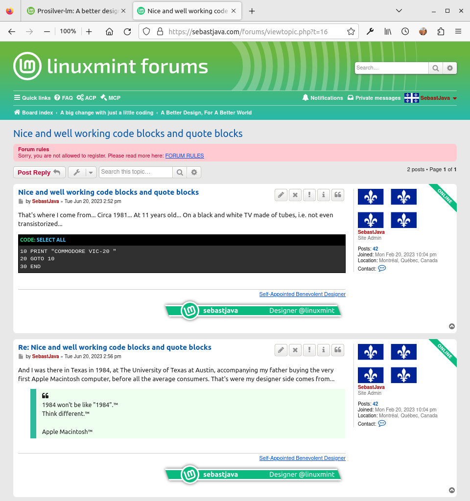
Half of the posts are too dark
The posts alternates between white and some kind of dark off white backgrounds. Those greyish green backgrounds. Thus you get to read some well contrasted and luminous post, made of dark grey text on white backgrounds, and then the next post is noticeably much darker, dropping into a quite lower contrast. Of course, this helps in separating the posts from each other, but there are other ways to achieve this.

Indistinguishable or pale hyperlinks
There are two kinds of hyperlinks. The ones that are part of the forums themselves, like for going from a topics list to a chosen topic, and the other ones: the links posted within the user's posts. The first ones, the forum's links are indistinguishable, getting approximately the same color as for normal text: `#444C3C` vs `#333333`. So, the user must guess where the links are ! And the other kind of links, the ones inside posts, well they are very light, they clearly lack sufficient contrasts, especially on visited links. To sum up, all the links looks very bad.

The forum title is lost in space
The "Linux Mint Forums" title, standing next to the logo, is just too small. And the "Welcome to the Linux Mint forums!" under it is just so small, I tend to ignore it. Thus, I mostly just see the logo and the title in there, and this title then feels like having a very bad vertical alignment. And also, the font is totally "generic".

An overload of rounded boxes
The page header is made of two separate elements: the header bar with the logo and the navigation bar under it. This feels too modular. Every element is a separate box with rounded corners. If at least the logo, search bar and navigation bar were grouped together into a single rounded box, that would already feel better, less modular.

The posts content text varies from dark gray to pure black
That's a bit hard to explain. Usually, on your "standard" Minty theme, the content text is made of dark gray: `#333333`. But when you click on a link to access a specific post within a topic, then the text is made of pure black: `#000000`. Take this Forum and Topic Icon Legend for example. Here, you click on that link to the topic, and you get normal text, in dark gray: `#333333`. But now, when you try to get to the same place, but using a link to the first post of that same topic, you get a pure black text: `#000000`. Test it: Forum and Topic Icon Legend. You end up in the same place, but with a different text color. That's bad. Most modern websites are not using pure black text on pure white backgrounds. It is all explained there: Why You Should Never Use Pure Black for Text or Backgrounds.

The quotes are just boxes inside boxes
The quotes are just another kind of boxes, again. And when facing quotes inside quotes, you are just facing hardly distinguishable grey boxes inside grey boxes.

Is that a title ?
Some titles are hardly distinguishable, being just slightly bigger bold text, with no noticeable color difference.

Please don't ruin my design
And lets not talk about those annoying ads that got added recently. I don't care much, because the design is already bad. But if the forums had a good design, those ads would just be in the way.

And there are still more things I could talk about but I will stop there... Images are worth a thousand words... Just take a look ! Everything got refreshed, and yet the coding is kept small and professional.

Think different:
https://sebastjava.com/forums/ (showcase until January 21, 2024)
https://github.com/SebastJava/prosilver-lm#readme (source code)

This is not just a main landing page mock-up. Far from it. The entire design got re-engineered. This includes many elements, even things you currently can't see as a guest, things like the control panel, for example. And this is not just some kid trying to tweak the CSS. It is all well done. Carefully done.

A better design would attract more people. And more money. And thus more developers. Thus less bugs. Which in turn would attract more people...
The future Linux Mint Forums is here.
Self-Appointed Benevolent Designer on Linux Mint Cinnamon.
Image
User avatar
sebastjava
Level 5
Level 5
Posts: 703
Joined: Wed Jun 28, 2017 8:01 pm
Location: Montréal, Québec, Canada
Contact:

Re: Prosilver-lm: A better design for these LinuxMint forums here

Post by sebastjava »

sebastjava wrote: Fri Jul 14, 2023 2:34 pm The quotes are just boxes inside boxes
The quotes are just another kind of boxes, again. And when facing quotes inside quotes, you are just facing hardly distinguishable grey boxes inside grey boxes.
I got a feeling some people did not even take the time to visit before voting against this new design. That's probably because of this word: "design". Design is not considered as being important here. Anyway, you want to keep this community small, and make sure the servers are not overloaded. :)

Well, after all this work done since last January, I wanted to insist once more. If you don't want to visit, here is a screenshot. Just one sample screenshot showing 2-3 things amongst many other things.


Image


Code blocks: Unlike your current Minty theme, this new Prosilver-lm displays code blocks in a similar fashion as for the real terminal. Thus everybody instantly knows what this is about. And it stands out and looks nice.

Quote blocks: And the quote blocks are not just boxes inside boxes. Here they are made nice and readable.

Excellent contrasts: And you also get to see a forum where the posts do not alternates between black on white and... black on some greenish gray background. Here all the posts are just black on white. And yes, I know, this text is not really pure black, but that's another story. This was explained before.

Here, just take a look at it for real, at 1:1 scale: Nice and well working code blocks and quote blocks

Oups ! Of course you can't see that link, with your pale greyish blue links. Here it is again, but this time using my links color:

Here, just take a look at it for real, at 1:1 scale: Nice and well working code blocks and quote blocks

P.S.: Please keep in mind you are looking at a screenshot here. Of course it doesn't look as good as the real thing. Get the real thing just by clicking above...
The future Linux Mint Forums is here.
Self-Appointed Benevolent Designer on Linux Mint Cinnamon.
Image
User avatar
grndplane
Level 4
Level 4
Posts: 245
Joined: Tue Jan 12, 2010 4:08 pm
Location: Sunny California - Where everything cost's twice what it should.

Re: Prosilver-lm: A better design for these LinuxMint forums here

Post by grndplane »

I use chrome dark mode and both themes have colors that are too bright and too dark.
-grndplane (Mike)
Linux Mint 21.x 64-bit
Kernel: 6.X-liquorix-amd64
WM: LeftWM
Post Reply

Return to “Suggestions & Feedback”